Thursday, July 19, 2007

Wii hacking

I just saw this video again in a post on n.e.r.d.

It's really great to see such lovely applications of hacking - the Wii remote connected to some usb thingie I presume and into a macbookpro and used as an input device for a sound/live video app using the Mac's internal iSight camera.

Great, inspiring stuff.

Labels: ,

Monday, April 23, 2007

Mark Corelan

Mark Corelan is a graphic designer who specializes in on-screen UI design for film and television. Sadly there are no actual screenshots in his website but there's a fun show-reel to watch.

Great stuff. (I also mentioned him in shmentura.)

Labels: ,

Sunday, January 21, 2007

Inspiring tactile interfaces

Demos of tactile interfaces are always very inspiring. They often present stuff like futuristic new input methods and some creative software that goes along.

Stuff like Jeff Han's demonstration at TED or the TactaPad really makes you drool over your browser. But I think that even smaller input method innovations are inspiring as well. When I heard about 3DConnexions' devices for the first time I was really excited. I even thought about the possibilities of trying to build something similar with a 2nd trackball mouse connected to my PC.

I think my general point is that even slight innovations in existing input methods can seed the creations of new applications. Even more moderate stuff as the MacBook Pro's multitouch touch pad (1 finger for pointing the cursor, 2 fingers for scrolling) can enable, for example, 3 fingers 3d panning (in ZBrush perhaps?), etc.

Labels: , ,

Sunday, December 17, 2006

The horrors of functionality restrictions

About a year ago, my girlfriend bought an Epson CX3500 printer. It caused many problems almost from day one: The ink would ran out too quickly, less expensive re-fill ink wouldn't work right, the expensive ink wouldn't work well as well and so forth.

One particularly annoying behavior was the printer's refusal to print grayscale / black & white documents when it's color cartridges are empty.

Each time I hear about this problem I just go nuts. It makes me want to throw the printer out to the street and buy another one. It's just completely incomprehensible to me that the developers/designers at Epson thought this can be considered as a reasonable behavior.

The printer's entire goal in life is to print documents. It's not an online ink shopping website. It's not an ink commercial. It should never refuse to print my documents unless it absolutely can't. It should have no problem printing b/w documents if it has Black ink.

I have an HP psc at home. I really disliked hp printers before but this one has just been great to me. This hp also has a similar problem, but it's less of a pain: it refuses to print anything if one of the cartridges is missing, but it will print a b/w document even if the color cartridge is empty.

Someone at Epson thought it's reasonable to ask users to buy color printer cartridges to print black and white documents. That someone is obviously wrong. Products should empower users, not restrict them.

Labels: , , ,

Tuesday, December 12, 2006

lineto

The folks at lineto sell fonts.

They have a nice site up with great navigation - based on the 3-pane file navigation of the iPod / Apple Finder.

Labels: , , ,

Friday, November 24, 2006

Inquisitor is genius

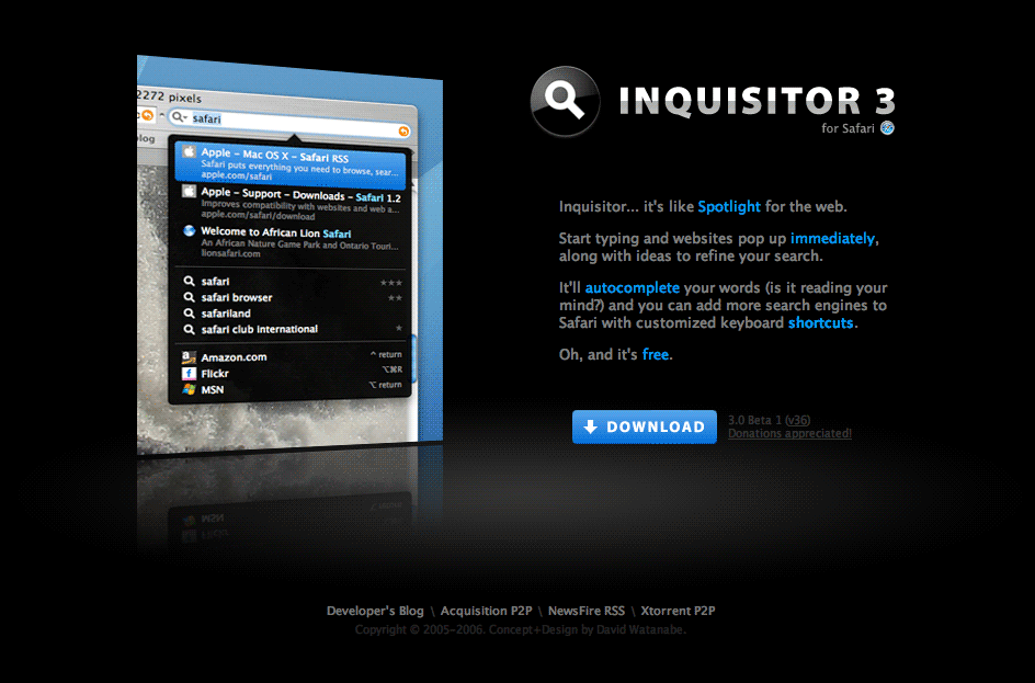
Inquisitor 3 is a great search plugin for Safari (apple's web browser). It implements Spotlight-like functionality for Safari. (just type something in the search box and get immediate highlighted results, autocompletion suggestions, etc).

This application is an immediate Bonzai. The developer just completely nailed it. It works amazingly fast, it's dead easy (since the user is only required to use the search box the same way he is already used to) and it works just great.

I just wish I could have that on Firefox on my mac, and actually, on Firefox everywhere.

Labels: , , , , ,

Sunday, November 12, 2006

Back to basics: bloatware vs. keeping things simple

I remember the first time I tried to download Easy CD. I was in a distant computer with broadband far from my house and wanted to burn some mp3s I downloaded quickly. I had a cd burner but no burning software.

I quickly found out that Easy CD was a 100mb or so download, and I could not be more surprised. A CD burning application that comes in the size of an iso image? Are they insane? Why should the burning application take 100 off my hard drive? (and this was 4 years ago.)

In a recent visit to Nero & Roxio websites I found out the situation today is much worse. Nero requires 288MB of 'permanent' disk space and Roxio's Toast requires 300MB of disk space.

Roxio and Nero forgot how to keep things simple. A burning application should just be able to burn cds and dvds. It shouldn't be the 1-stop-home-media-editor. It doesn't need a wave editor, and a photo organizer.

Disco is a new (very hyped) burning application. It is what one might call a trendy-eyecandy-ish burning application. But other than being really pretty, it has one important feature - it's an insanely small, 700 KB download! It's a small, minimal, simple application that helps me get things done and doesn't take too much space.

Why is that so special nowadays?

Labels: , , , , , , ,

Monday, November 06, 2006

Flatlab


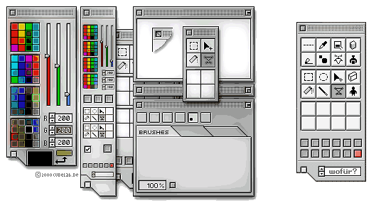
Flatlab is a home for some weird graphic artwork: icons, pixel graphics and my main intrest: expressive GUI mockups.

Flatlab was formely known as CubeLab in the BeOS community, where several cubelab inspired themes exist.

Labels: , , , ,

Friday, October 27, 2006

Interaction Desing Inspiration

Two blog links for interaction design inspiration:

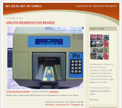
1. no ideas but in things:
website thumbnail screenshot
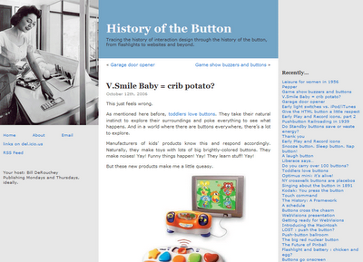
2. History of the Button:
website thumbnail screenshot

Labels: , , , ,

Wednesday, October 25, 2006

Wet Floor Interfaces and user confusion

Nero is a well known CD/DVD burning application. It allows users to create various CD/DVD formats fairly easily.

I've noticed an annoyance in Nero almost instantly when I started using it: It's burning dialog has the Stop button highlighted (focused) by default.

When a user clicks the Burn button in Nero, the dialog above opens and the burning process is started. But Nero makes it far too easy for the user to cancel the process by mistake.

This is what one might call a Wet Floor Interface, it invites user errors when it actually intents to create a clean one-task interface. The burning process is Nero's epicentre but it's interface makes it too easy for users to accidentally slip on the floor and break something.

User interface design is often about making the right thing easy and the wrong thing hard. Interfaces like Nero's burning dialog are not too hard, but someone should go over them with a towel and wipe the water off the floor.

Labels: , , , ,

Saturday, October 14, 2006

How to score on a date with your users (or: Setting realistic expectations)

Some episodes of MADtv included a returning sketch called Lowered Expectations. The sketch featured weird candidates appearing in a video dating service for those who have 'low expectations'. In a similar way, developers often need to lower their expectations in order to enable successful user/software interactions.

Application developers often expect their users to perform unrealistic tasks. They require users to recall many details, click miniature links with their mice or precisely type long URLs:

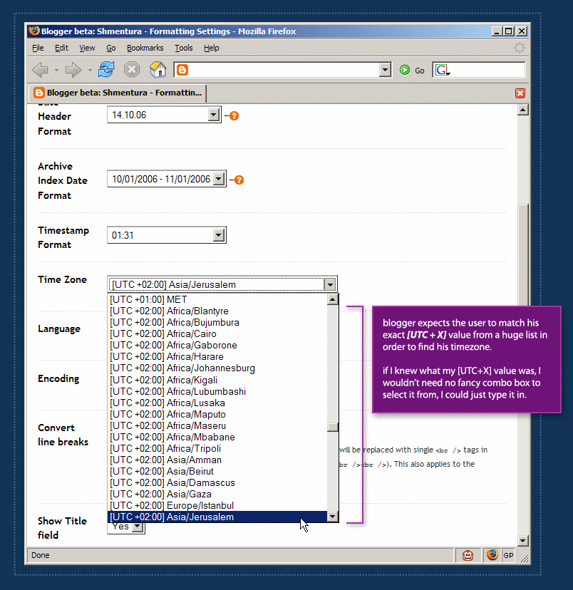
In order to define a blog's timezone in Blogger, a user must scroll through a huge list which is sorted by the [UTC+X] offset values. Each item in the list includes the UTC offset of the timezone, continent name and a major city in the area.

Blogger is setting unrealistic expectations. It actually expects the user to know his UTC offset in order to find his location on the list. After a 3-4 minutes of scrolling back and forth, I remembered Israel is either UTC+2 or UTC+3. But defining my blog timezone should not take 4 minutes.

Realistic expectations take user abilities into consideration. It's reasonable to assume that the user can define his location with no problem, but it's completely unreasonable to assume that he knows his UTC offset value.

So how do you score on a date with your users? You make it dead-easy for them to achieve their goals and make it hard for them to get confused and make mistakes.

Labels: , , , , , , ,

Tuesday, October 10, 2006

Stressed out message boxes and design alternatives

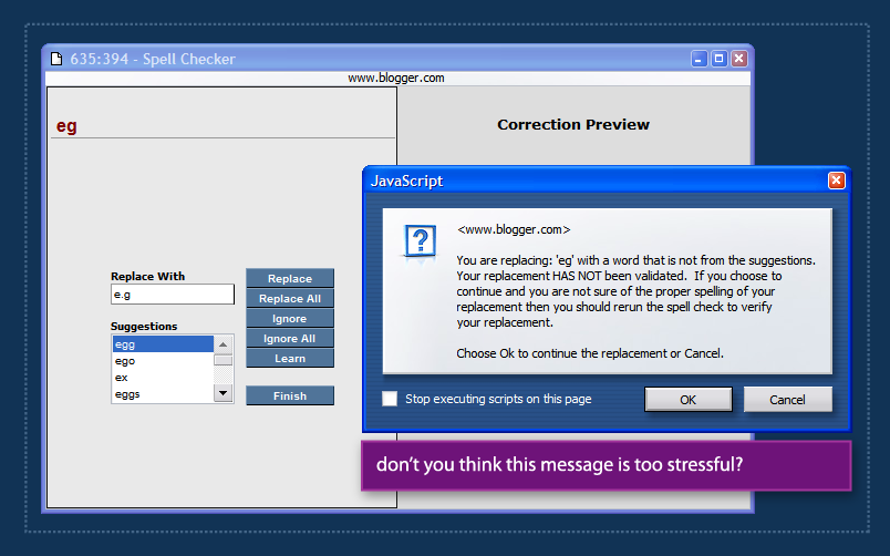
A while ago I was using blogger's spell checking feature (the old version in blogger's pre-beta). During spellcheck, blogger found an error in my spelling and displayed a list of suggestions. I wasn't very happy with the suggestions so I entered my own text in the 'replace with' box and hit Enter.

Blogger then displayed the message box above, telling me that I chose to replace the erroneous text with my own input that was 'NOT VALIDATED' and recommended that I run spell check again.

Aside from being way too stressful, this message text is also way too long. users don't read message boxes. In fact, users dont read.

Sometimes a developer/designer realizes that a message might not be very clear to the user and decides he/she has to do something about that, but usually, decorating the text with ALL CAPS or adding more text just doesn't cut it. Message copy has to be simple and get out of the way quickly. Sometimes, using other design elements (such as a dialog that suggests, "run spellcheck again?") can help solve such issues instead of just wrestling with more text & effects.

If you're interested, Humanized has an interesting article about silly message boxes and some alternative solutions.

Labels: , , ,

Sunday, October 08, 2006

MSN Video "Simplicity": Install 3 applications and we'll let you right in

It's no secret that online Microsoft websites often have problem with non IE browsers. But I was really surprised to see MSN Video Israel demanding so much from me when I first entered the site to watch a flick.

The Israeli MSN Video version requires the user to: (free translation from Hebrew) "verify" that his computer "complies with the requirements" and then click the "activate MSN Video link. The problem is, in my opinion, that if the user actually installs those applications, he'll be forced to reboot his computer and won't be able to click this link. Not to mention the fact that the video he originally came to see will be forgotten, surely it's URL will be lost.

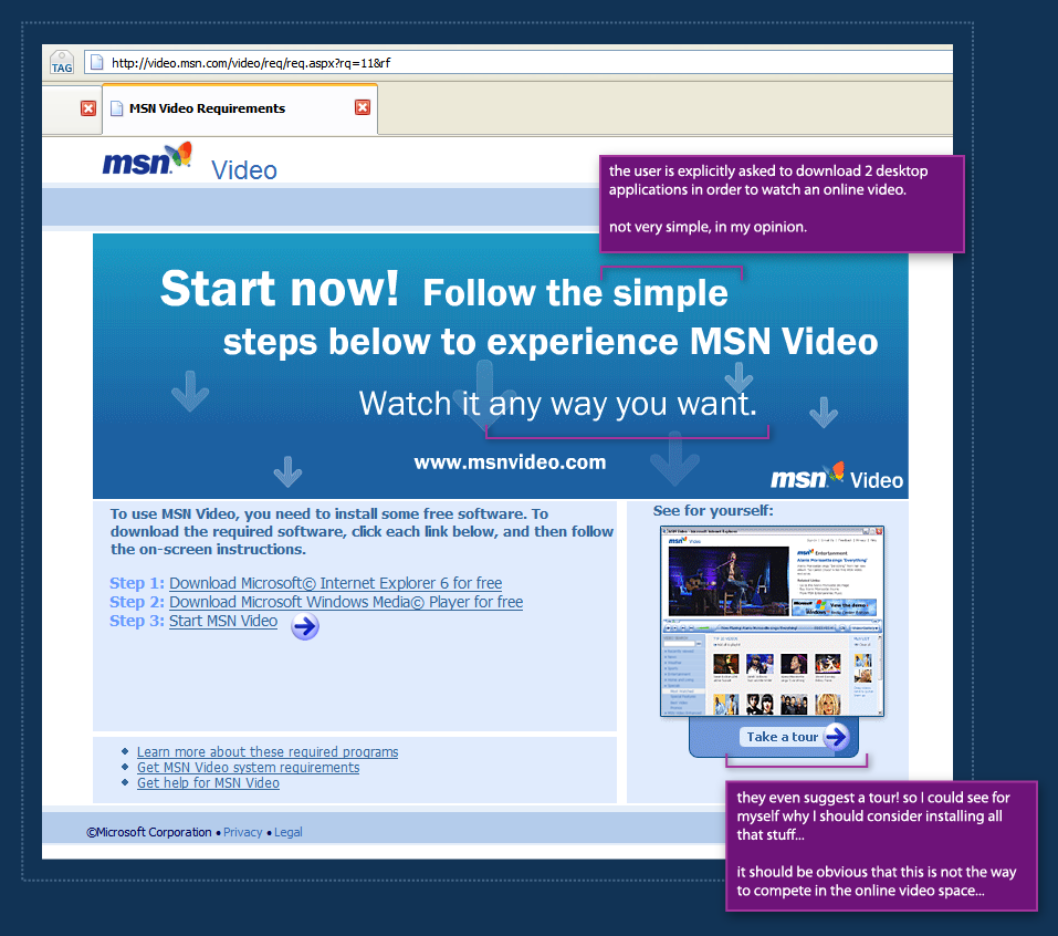
MSN Video in English has a different screen, but I'm not sure which is worse. This version suggest 3 simple steps. If this is Microsoft's idea for simplicity, someone clearly has a problem. The site even goes further by suggesting a tour! they're trying to convince me it just might be worth it to download and install this stuff.

The whole point of services like YouTube is leveraging software users already have installed and making it dead-easy to share media on the web. MSN Video clearly demands too much from new users.

This is clearly not the way to compete in the online video space.

Labels: , , , , , , ,

Friday, October 06, 2006

Wrong indication and scaring users off

When a new user visits bloggerforum, he sees an image similar to the one above. bloggerforum makes an exceptional effor to inform the user what he can and cannot do. It seems, however, that the user can hardly do anything.

One can assume that the bloggerforum people dont want to scare people off deliberately. The problem is that they're displaying unfiltered information. Someone thought that it's really important to tell the user exactly what he can and cannot do, instead of just placing a reply button for the thread and asking the user to sign up (or sign in) on the next page.

The register to post links are the most important ones on the entire page. They're the door for the most important interaction any user can have with a forum system - post in the forum. These links are not well placed and unlike some other links on the page (previous post, next post, etc.) have no images next to them.

Good design is often about creating clear hierarchy. Communicating to the user visually what is important and what isn't. bloggerforum clearly needs a hierarchy make over.

Labels: , , , , , ,

Friday, September 29, 2006

Howto: create vector application mockups using Visio & Illustrator

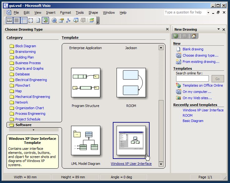
Visio 2003 is a great tool for creating mockups of Windows XP user interfaces. It features a complete stencil that includes many common windows control that were re-drawn as Visio vector shapes.

However, by itself, Visio isn't always sufficient for creating an entire, detailed application mockup. such mockups often require graphics that are hard to produce on Visio alone.

This quick tutorial will show you how to create a detailed vector mockup using both Visio and Adobe Illustrator.
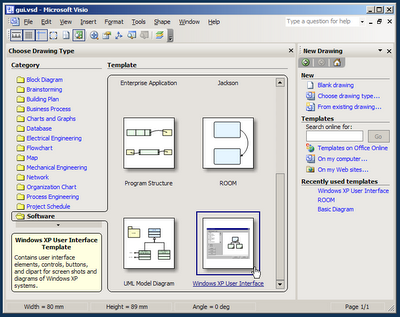
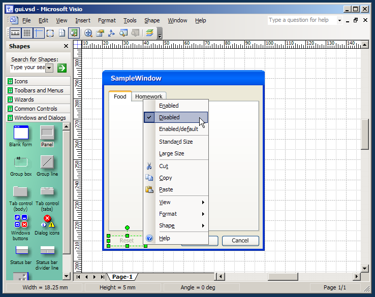
When you first start Visio, the Choose Drawing Type screen appears. choose the Windows XP User Interface drawing type from the Software catagory.
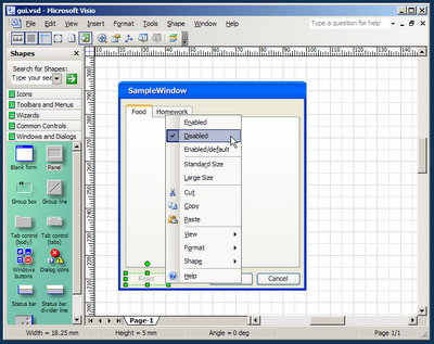

Design your application form using the common controls and shapes found in the stencils on the left. Drag a form first, followed by some buttons and panels. Note: most controls have options that can be set using the context menu.
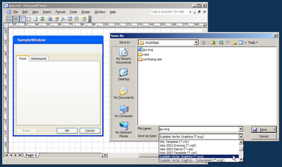

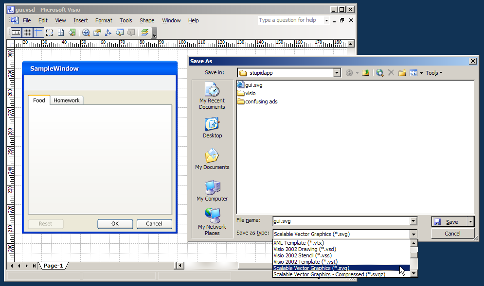
Goto File->Save As and save your file as a SVG file. SVG stands for "Standard Vector Graphics". it's a file format used by many vector graphics applications to exchange drawings. We will open this file with illustrator for further editing. Copying and Pasting the contents of your mockup from Visio to Illustrator might seem quicker, but it doesn't produce well-organized results. (it seems to create redundant, inaccurate shapes.)
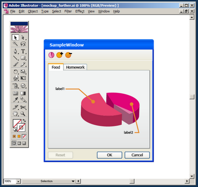

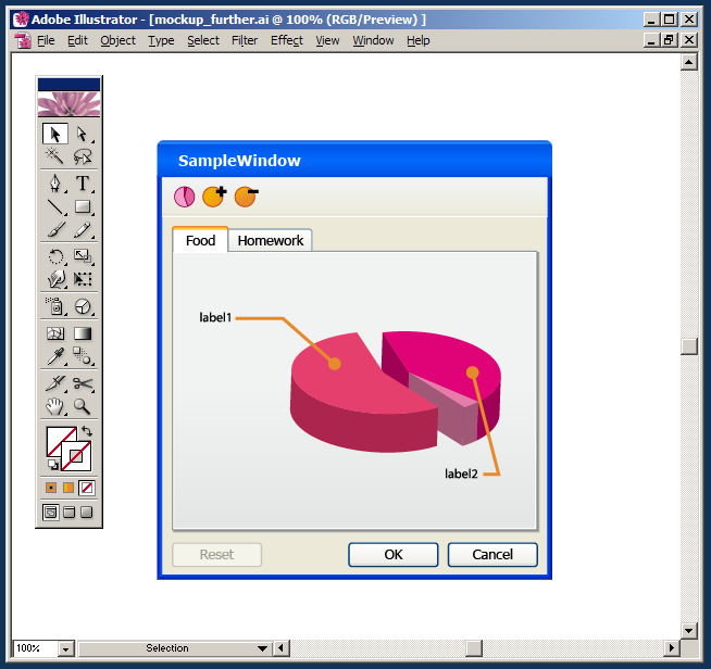
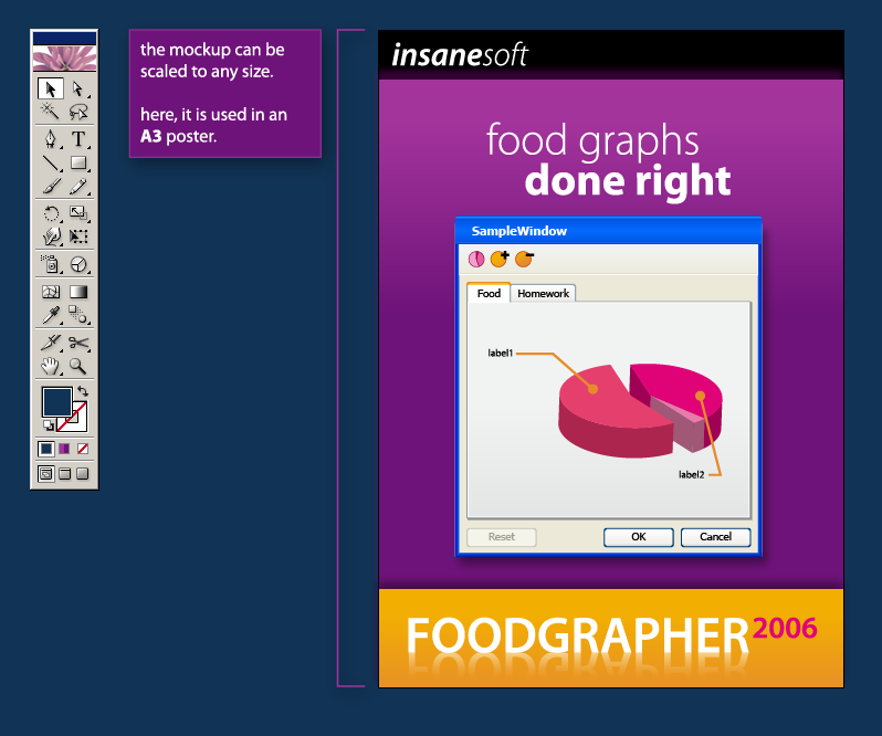
Open the .SVG file with Adobe Illustrator and edit it further. add some special graphics that could not be done in Visio. (here, I added a 3d pie chart and some quick toolbar icons). When initially opened, the file's content might be over-grouped, select your mockup form and hit Ctrl+Shift+G (Ungroup shortcut) until the mockup is completely un-groupped so you can work with it. You can also add another layer above the mockup and lock the layer holding the mockup for easier editing.
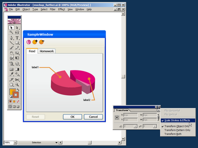

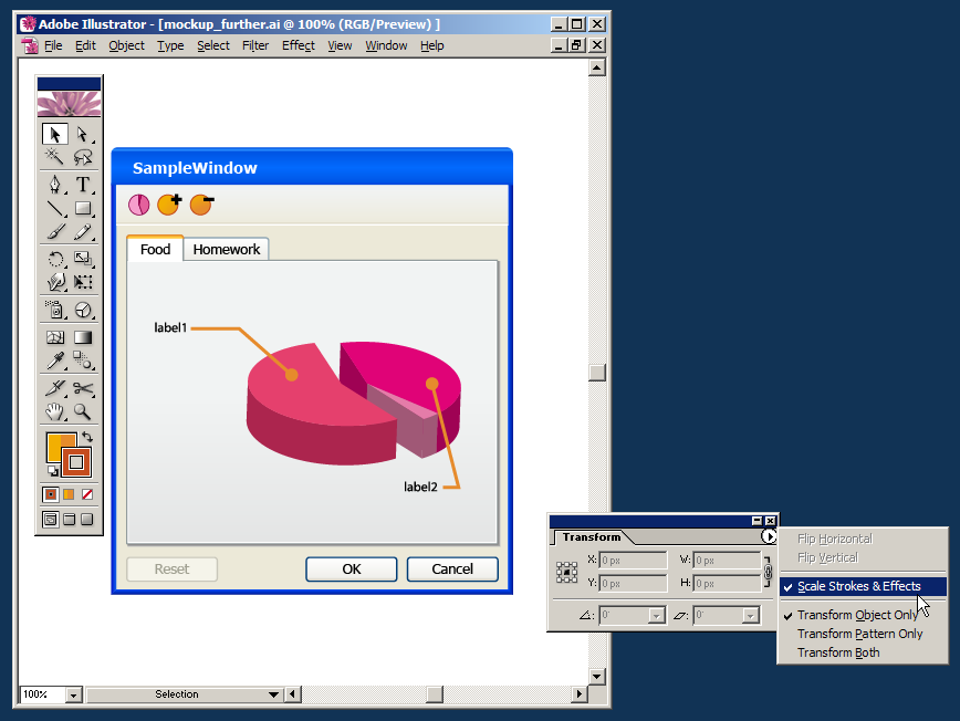
When you're done working on the mockup in Illustrator and ready to use it in another vector file (a Campaign Poster, in my case), make sure the Scale Strokes and Effects option is checked. (this option can be found in the Transform window - open it from Window->Transform.) when turned on, this option tells Illustrator to scale the line strokes and effects applied to each shape. It then allows the scaling of our mockup into any size, without damaging and line work or quality.
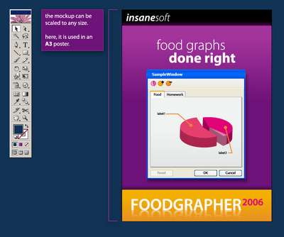

Finally, place the finished mockup into your desired vector drawing, scale it (proportionally - holding Shift) into the desired size. In the screenshot above I've used my mockup in an A3 sized poster.

Great work. We've just created a resolution independent mockup of our imaginary app. We can now make versions of it for our website, posters and T shirts.

Labels: , , , , , , , ,

Friday, September 22, 2006

The Programmer's inner Designer: syntax color tweaking

Ever since I started writing code, I've always found great interest in Syntax Coloring. At the same time, however, I found it a bit weird that I enjoy tweaking and re-tweaking my syntax highlighting colors so much.

I was very happy to see a few recent posts over at coding horror about syntax coloring and programming font choices and immediately felt the need to share my own thoughts about syntax color palettes.

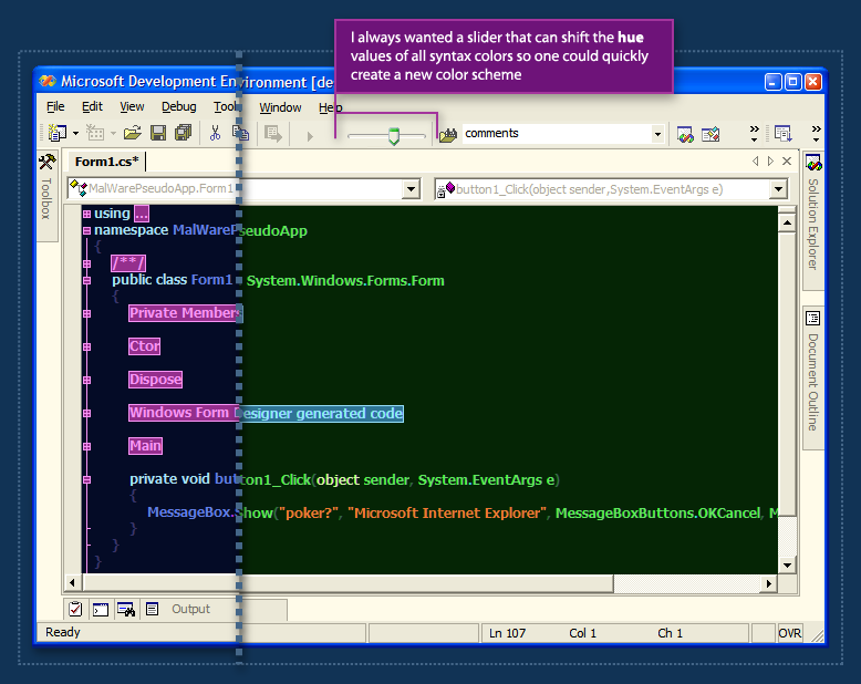
During my work with .net in the last 4 years, I've slowly tweaked my color scheme to the screenshot above. It uses the font Tahoma Bold even though its not a fixed-width font. At it's brightest days, there were 4 of us using it. We once shouted the RGB values of the entire palette across the workspace to a person sitting in a distant cubicle. (that was before we realized we can export the palette from the registry...)

I always wanted to have a small slider in the IDE's toolbar that would allow the user to slide all the hue values of the syntax colors so the user would be able to create a new color palette for each file, or just play around. Since the original palette is usually already color-balanced, shifting the entire palette around the hue axis should not break much of that balance, and it would create fun results. (see the screenshot above)

I think this coloring customization is appealing to people in the same way that desktop wallpaper and ring tones appeal to others. Customization of apps one uses every day is just fun. When you spend a few minutes thinking about it, it's a lot like your clothing choices. People are actually trying to communicate something about themselves using their ring-tone choices. People are communicating something about themselves with their clothing & wallpaper choices.

What are we saying about ourselves through our syntax color scheme choices?

Labels: , , , , , , , , , ,

Wednesday, September 20, 2006

Leveraging user familiarity to increase usability

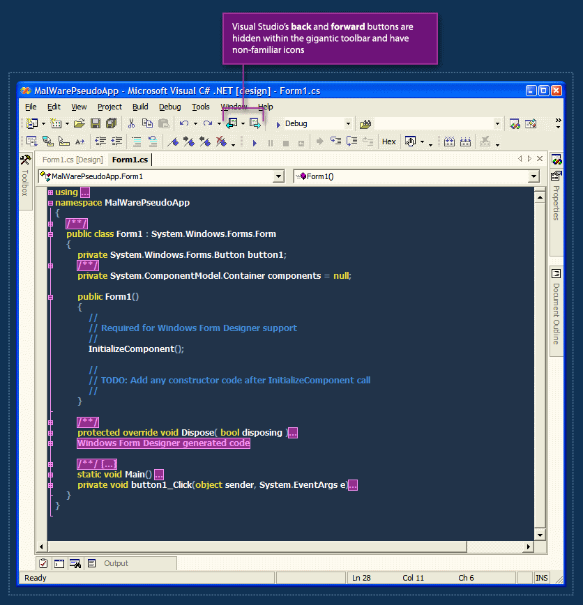
Visual Studio.net has a nice back & forward feature. This feature allows the user to jump through recently visited locations in his code files. The problem with this feature is that it's practically hidden from the user.

The back & forward buttons are almost-randomly placed within the crowded toolbar, and they also have non-familiar icons. I often hover the toolbar back and forth with the mouse cursor until I'm able to find the back button with my eyes.

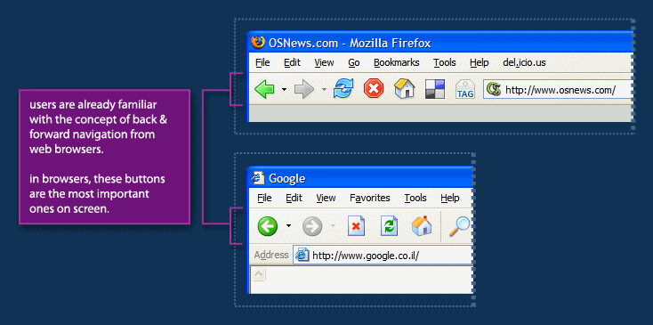
In web browsers, from which this metaphor is borrowed, the back & forward buttons are by far the most important ones on screen. They are placed in the far left of the toolbar making them easy to hit with the mouse and they are the perceived as one of the cornerstones of navigation on the web.

The Visual Studio Team did a great job with borrowing the back & forward metaphor from web browsers to the code-editor world, but they could go further by leveraging users' familiarity with the placement and visual-styling of these buttons to make this feature more noticable - and as a result, make code navigation easier.

Labels: , , , , , , , ,

Saturday, September 16, 2006

Life, Death & Visual Indication


This is a story of a life, death and worrying sick due to a wrong visual indication.

Some time ago, my grandmother went through heart surgery. During the surgery, me and my family were sitting in the waiting room and watching the surgery board. The surgery board lists patients' initials and their current status. It has only 6 lines and multiple 'pages' that rotate every 20 seconds or so.

The patient status can be one of 3 values:
  • in surgery
  • in recovery (still inside the surgery room, but surgery is done and patient is recovering.)
  • transferred back to department (which means recovery is done and patient is transferred back to his department for further treatment.)
In addition to the board indication, when an operation is finished, a doctor comes out of the surgery room and talks to the relatives about the results of the surgery.

Normally, a patient goes from being in surgery to being in recovery and then being transferred back to department. some time after that, the patient's name is removed from the board.
When we arrived to the waiting room, we saw my grandma's initials on the board and the status said "in surgery". 40 minutes later however, the name was suddenly removed from the board.
When I suddenly noticed the name was removed (3 pages flipped by and she wasn't there), I thought it's probably just a mis-update or an update lag. I figured the silly software that updates the board from remote probably removes the name and then re-adds it later with the new status, but I waited about 5 mins and the name didn't return to the list.
I then told my parents that the name was removed and they slowly started to freak out.
It started to look really bad, we waited a few more minutes and then rang the intercom outside the surgery room. It took a few minutes for a nurse to come out and during those minutes my brother and mother already started crying.
When the nurse came back she told us the surgery was successful & grandma had already been transferred back to her department.
At that point I started to be really upset. The stupid indication on the board made my family worry that grandma's surgery had failed, and it was only due to a mis-feed of data.
We finally realised that the doctor came out of the surgery room early and didn't find us, then someone forgot to update the board leaving the status 'in surgery'. When someone finally noticed the status was wrong, he simply removed the line from the board.
This is a case of a visual indication gone terribly wrong. But it can also demonstrate the way in which people interact with computer applications. The person in-charge of updating the board forgot to update it initially - which made the displayed status irrelevant, only to later remove the entire row and render the status terribly terribly wrong.

A few questions come to mind:
  • should the application allow the user to delete the patient's entry when it's in status in surgery?
  • Within the surgery staff, who should be responsible for updating patient's status?
  • Is there a way to avoid such errors in the future?
  • Was the problem inevitable or perhaps an interface change could prevent it?

Labels: , , , , , ,