Saturday, September 30, 2006

Songbird is exciting

Songbird is an open source iTunes type media player (from Mozilla) with an internal browser that extract media files from web pages and allows the user to easily download and listen to music all around the web. It's a surprisingly small download (10Mb) and has a nice user work flow.

The default feather (skin) is too dark in my opinion, mostly has problem with the Menu styling, but that's an early pre release and will probably improve with time.

And of course, it works well with the radio station that took me through the last graphic design semester - kink fm.

Labels: , , ,

Friday, September 29, 2006

Howto: create vector application mockups using Visio & Illustrator

Visio 2003 is a great tool for creating mockups of Windows XP user interfaces. It features a complete stencil that includes many common windows control that were re-drawn as Visio vector shapes.

However, by itself, Visio isn't always sufficient for creating an entire, detailed application mockup. such mockups often require graphics that are hard to produce on Visio alone.

This quick tutorial will show you how to create a detailed vector mockup using both Visio and Adobe Illustrator.

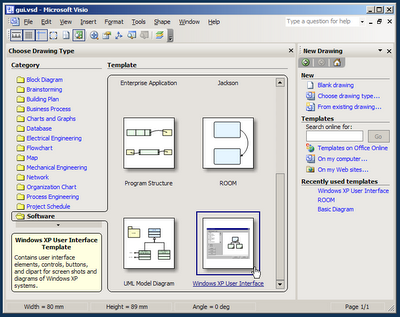
When you first start Visio, the Choose Drawing Type screen appears. choose the Windows XP User Interface drawing type from the Software catagory.


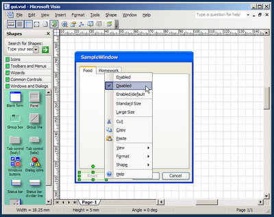
Design your application form using the common controls and shapes found in the stencils on the left. Drag a form first, followed by some buttons and panels. Note: most controls have options that can be set using the context menu.
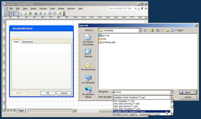
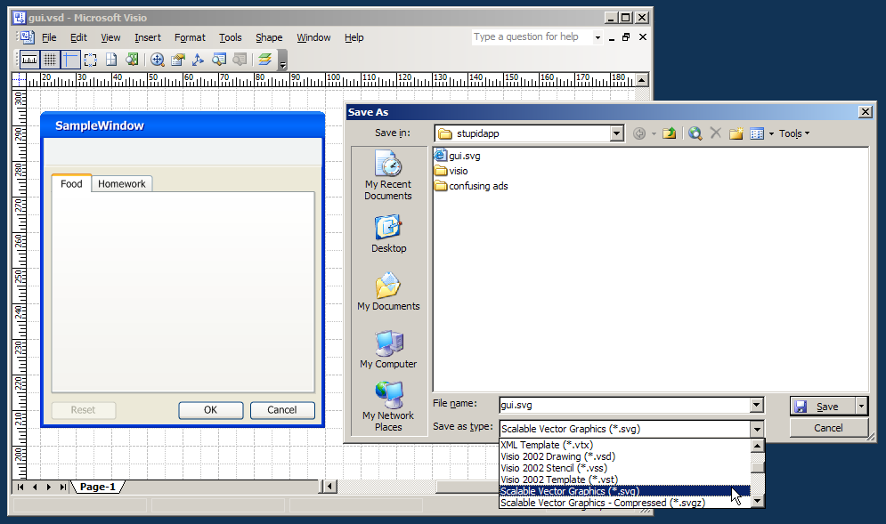

Goto File->Save As and save your file as a SVG file. SVG stands for "Standard Vector Graphics". it's a file format used by many vector graphics applications to exchange drawings. We will open this file with illustrator for further editing. Copying and Pasting the contents of your mockup from Visio to Illustrator might seem quicker, but it doesn't produce well-organized results. (it seems to create redundant, inaccurate shapes.)
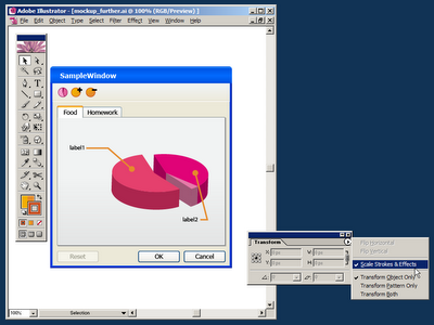
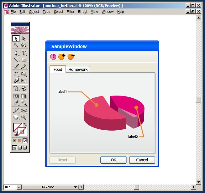

Open the 
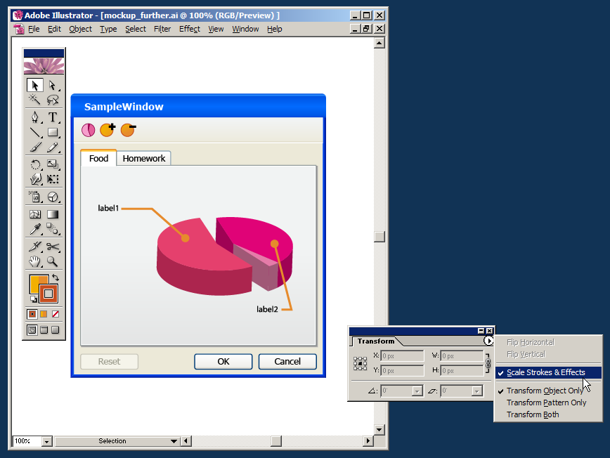
.SVG file with Adobe Illustrator and edit it further. add some special graphics that could not be done in Visio. (here, I added a 3d pie chart and some quick toolbar icons). When initially opened, the file's content might be over-grouped, select your mockup form and hit Ctrl+Shift+G (Ungroup shortcut) until the mockup is completely un-groupped so you can work with it. You can also add another layer above the mockup and lock the layer holding the mockup for easier editing.


When you're done working on the mockup in Illustrator and ready to use it in another vector file (a Campaign Poster, in my case), make sure the Scale Strokes and Effects option is checked. (this option can be found in the Transform window - open it from Window->Transform.) when turned on, this option tells Illustrator to scale the line strokes and effects applied to each shape. It then allows the scaling of our mockup into any size, without damaging and line work or quality.


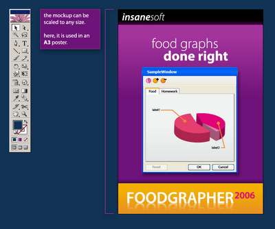
Finally, place the finished mockup into your desired vector drawing, scale it (proportionally - holding Shift) into the desired size. In the screenshot above I've used my mockup in an A3 sized poster.

Great work. We've just created a resolution independent mockup of our imaginary app. We can now make versions of it for our website, posters and T shirts.

Labels: , , , , , , , ,

Wednesday, September 27, 2006

Quick links round 5 - Comics

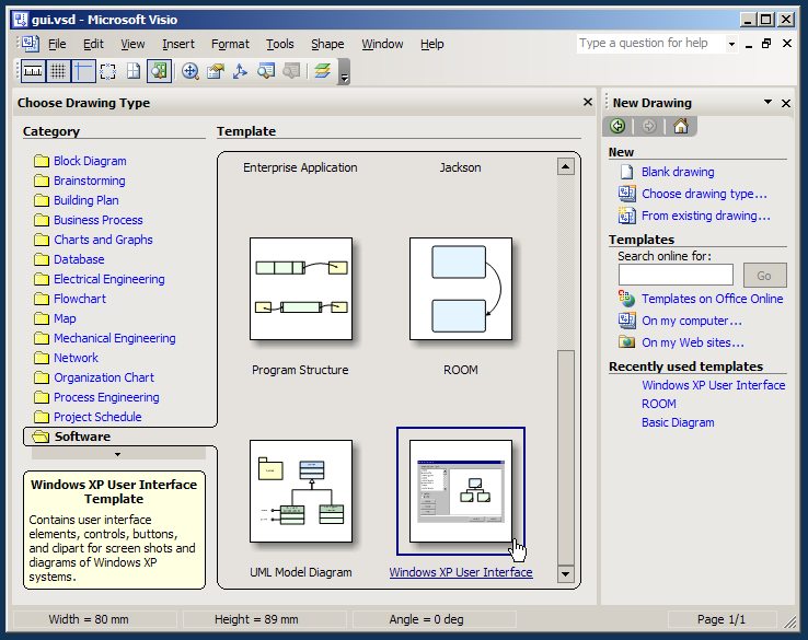
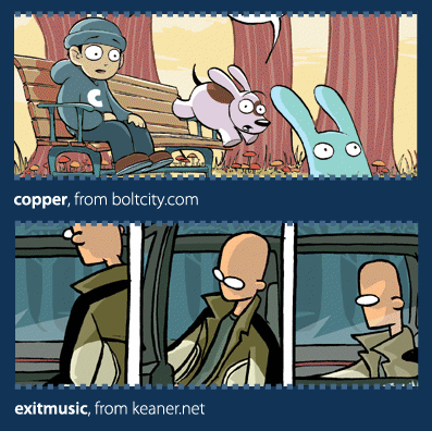
Some quick (but great) comics related links:

check out ojingogo, you'll fall in love.

keaner.net makes touching, emotional comics. (and if someone needs a direct link, there.)

boltcity.com - Kazu Kibuishi's great illustration/comics blog, featuring full strips of the great copper, as well as a great step-by-step making-of guide.

Ok/Cancel - Kevin Cheng and Tom Chi's comics strips about user interface design and the tech industry.

flight comics - home blog of the flight comics group books

the creatures in my head - one creature each day.

Labels: , , ,

Monday, September 25, 2006

Quick links round 4 - graphic design

First of all, the great designer's mixtape, filled with fun music and sorted by designer

Amazing amazing imagery from gneborg.net, especially this stuff.

Lots and lots of work from SerialCut, all in one page.

I really love the work of jp33, containig several one page porfolios.

A massive portfolio from superstar Joshua Davis

Great illustrations from CouscousKid.

Labels: , ,

Saturday, September 23, 2006

Media drives happiness - designing inspiring online platforms

For some time now, my grandmother is having problems with her eyesight. During this time, she's having problem reading and enjoys German audio books very much. She can use them to re-cap on childhood books she had forgotten, or on large classics she didn't find the time to read.

A few months ago, my dad asked me if I could find some mp3s of piyutim (Jewish prayers) from Turkish synagogues in Israel recorded at Yom Kipur. He said that my grandfather (from my father's Turkish side) loves hearing prayers on tape and perhaps I "could find some on the Internet".
At first, I told my father's there's no way I could find such extremely specific content online. German audio books were reasonably popular, but Hebrew mp3 recordings of Jewish prayers taken at Turkish synagogues? that's completely nuts.
I told him that finding audio book versions of popular geeky-stuff is very easy. stuff like Tolkien's LOTR is all over the place, but what he was asking was just too much for conventional media availability on the net.

A few months later I read in Haaretz about a site called piyut. It took me a few minutes to realize what it was all about, but when I followed the link to the site I found a categorized list of recordings. I was quickly able to download about 140mb of recordings and burn them for grandpa.

My grandpa was thrilled. He keeps talking about the 2 audio-cds I burnt for him and listens to them again and again.

The fact I could actually find these exact recordings (Turkish, from Yom Kipur, no less) on the net is astounding. It was simply incredible. Sometimes web/software platforms enable great things. This is clearly the case here.

Certain types of media can touch our lives. They can drive happiness. Certain software/online platforms can make this possible. piyut made my grandpa happier. He's not even aware of the files' origin, but they excite him nonetheless.
Designers and developers can create platforms that truly excite people. These platforms deserve to be acknowledged so we can analyze their success and be inspired.
What platforms do you find inspiring?

Labels: , , , , ,

Friday, September 22, 2006

The Programmer's inner Designer: syntax color tweaking

Ever since I started writing code, I've always found great interest in Syntax Coloring. At the same time, however, I found it a bit weird that I enjoy tweaking and re-tweaking my syntax highlighting colors so much.

I was very happy to see a few recent posts over at coding horror about syntax coloring and programming font choices and immediately felt the need to share my own thoughts about syntax color palettes.

During my work with .net in the last 4 years, I've slowly tweaked my color scheme to the screenshot above. It uses the font Tahoma Bold even though its not a fixed-width font. At it's brightest days, there were 4 of us using it. We once shouted the RGB values of the entire palette across the workspace to a person sitting in a distant cubicle. (that was before we realized we can export the palette from the registry...)

I always wanted to have a small slider in the IDE's toolbar that would allow the user to slide all the hue values of the syntax colors so the user would be able to create a new color palette for each file, or just play around. Since the original palette is usually already color-balanced, shifting the entire palette around the hue axis should not break much of that balance, and it would create fun results. (see the screenshot above)

I think this coloring customization is appealing to people in the same way that desktop wallpaper and ring tones appeal to others. Customization of apps one uses every day is just fun. When you spend a few minutes thinking about it, it's a lot like your clothing choices. People are actually trying to communicate something about themselves using their ring-tone choices. People are communicating something about themselves with their clothing & wallpaper choices.

What are we saying about ourselves through our syntax color scheme choices?

Labels: , , , , , , , , , ,

Wednesday, September 20, 2006

Quick links round 3

Dan Russell (also from creating passionate users) writes about user responses and learning from design failures - user quote:
“..the most white male fascist tool I’ve ever had the misfortune to use…”
Typeworkshop: home of some experimental typography workshops - students create letters with snow, 100s of books and plain pen and paper.

Artlebdev: huge russian design studio site, lots of great graphic design, identity systems, etc. (and home of the much talked about optimus keyboard).

Conclave: a wacky typography russian studio site. great use of flash and generally creepy.

Labels: ,

Leveraging user familiarity to increase usability

Visual Studio.net has a nice back & forward feature. This feature allows the user to jump through recently visited locations in his code files. The problem with this feature is that it's practically hidden from the user.

The back & forward buttons are almost-randomly placed within the crowded toolbar, and they also have non-familiar icons. I often hover the toolbar back and forth with the mouse cursor until I'm able to find the back button with my eyes.

In web browsers, from which this metaphor is borrowed, the back & forward buttons are by far the most important ones on screen. They are placed in the far left of the toolbar making them easy to hit with the mouse and they are the perceived as one of the cornerstones of navigation on the web.

The Visual Studio Team did a great job with borrowing the back & forward metaphor from web browsers to the code-editor world, but they could go further by leveraging users' familiarity with the placement and visual-styling of these buttons to make this feature more noticable - and as a result, make code navigation easier.

Labels: , , , , , , , ,

Sunday, September 17, 2006

Quick link round 2

Candy, a wonderful full-length 500-pages design magazine, great, wonderful visuals and inspiration. (downloadable PDFs from the site).

Vectorika magazine, PDF based graphic design magazine, great eye candy.

How to be creative, a PDF manifesto by Hugh MacLeod. (he also responsible for the very well known business card-illustration based blog gapingvoid.com)

Scribbler - a generative illustration app, draw a little drawing and see scribbler manipulate it with lines, colors and such.

Typedrawing - draw with typography, great flash-based app for text based drawing.

Labels: ,

Saturday, September 16, 2006

Life, Death & Visual Indication


This is a story of a life, death and worrying sick due to a wrong visual indication.

Some time ago, my grandmother went through heart surgery. During the surgery, me and my family were sitting in the waiting room and watching the surgery board. The surgery board lists patients' initials and their current status. It has only 6 lines and multiple 'pages' that rotate every 20 seconds or so.

The patient status can be one of 3 values:
  • in surgery
  • in recovery (still inside the surgery room, but surgery is done and patient is recovering.)
  • transferred back to department (which means recovery is done and patient is transferred back to his department for further treatment.)
In addition to the board indication, when an operation is finished, a doctor comes out of the surgery room and talks to the relatives about the results of the surgery.

Normally, a patient goes from being in surgery to being in recovery and then being transferred back to department. some time after that, the patient's name is removed from the board.
When we arrived to the waiting room, we saw my grandma's initials on the board and the status said "in surgery". 40 minutes later however, the name was suddenly removed from the board.
When I suddenly noticed the name was removed (3 pages flipped by and she wasn't there), I thought it's probably just a mis-update or an update lag. I figured the silly software that updates the board from remote probably removes the name and then re-adds it later with the new status, but I waited about 5 mins and the name didn't return to the list.
I then told my parents that the name was removed and they slowly started to freak out.
It started to look really bad, we waited a few more minutes and then rang the intercom outside the surgery room. It took a few minutes for a nurse to come out and during those minutes my brother and mother already started crying.
When the nurse came back she told us the surgery was successful & grandma had already been transferred back to her department.
At that point I started to be really upset. The stupid indication on the board made my family worry that grandma's surgery had failed, and it was only due to a mis-feed of data.
We finally realised that the doctor came out of the surgery room early and didn't find us, then someone forgot to update the board leaving the status 'in surgery'. When someone finally noticed the status was wrong, he simply removed the line from the board.
This is a case of a visual indication gone terribly wrong. But it can also demonstrate the way in which people interact with computer applications. The person in-charge of updating the board forgot to update it initially - which made the displayed status irrelevant, only to later remove the entire row and render the status terribly terribly wrong.

A few questions come to mind:
  • should the application allow the user to delete the patient's entry when it's in status in surgery?
  • Within the surgery staff, who should be responsible for updating patient's status?
  • Is there a way to avoid such errors in the future?
  • Was the problem inevitable or perhaps an interface change could prevent it?

Labels: , , , , , ,

Quick link roundup


A few quick links:

*Goldmine* A full-length presentation podcast (mp3) starring Kathy Sierra from Creating Passionate Users in the SXSW06 convention. Kathy talks about helping users kick ass, making them happy, helping users train and improve, make users feel better about themselves as a result...

A new blog for amazing illustrator Ashley Wood. (got the link from Maya.)

Ideas on Ideas - a blog about design, design writing and thinking (also, it has great layout).

Coding Horror - software development horror, ".Net and human factors".

The Lure of the Single Click - peterme from the adaptivepath blog talks about single click interfaces.

Labels: ,

Wednesday, September 13, 2006

Full length movie: Pollinate


Motion graphics studio Belief released a great movie called Pollinate (.mov for download).

The movie talks about design inpiration, process, idea recycling, synthesis and design thinking. It's 45 min long and very engaging.

A must see for any Designer / Student.

Labels:

Monday, September 11, 2006

What Am I?


Elyse Sanchez writes about the many changing job descriptions of an Interaction Designer / User Experience Designer / etc. and the need to create a power-point presentation just to explain what you do all day.

I frequently wonder about this myself as I work as a .net developer and interaction designer within our project at work and studying graphic design (soon to be interaction design) while I'm at it...

Anyhow, it's an interesting read...

Sunday, September 10, 2006

Choosing the right paradigm: complex dialogs and control choice


At work, we make extensive use of Steema TeeChart. TeeChart is a gui component that can render great looking 2d and 3d charts for a variety of applications. We're also exposing its TeeChart Editor in our own gui design applications so users can custom the look and behaviour of such charts.

However, the Steema Editor makes customization extremely difficult because it uses a monstrous amount of Tab pages. in the screenshot above, the user has navigated through 5 (!) levels of tabs in order to get to his desired setting. These tabs are structured - every line has a selected tab that holds all tabs within the next line. At work, both users and developers repeatedly fail at customizing such charts because they just can't remember where the desired settings are. (there are many options, and the navigation through them are very confusing).

The main problem here is that structured information is badly displayed. The tab pages are confusing and although they are supposedly structured, they do a very bad job at visualizing the customization categories TeeChart offers.

A better example of structured settings display can be seen in Eclipse's Preferences dialog. The customization categories are structured in a similar way but they are visualized using a tree-view. Tree views provide straightforward display of structured information and allow easier navigation.

Eclipse goes further by adding hyperlinks within the actual settings view, together with a conventional set of back & forward buttons - which users are very familiar with from the web-browser world. (although they are mis-placed in a non-conventional spot within the actual dialog and look a bit too-different from the common back/forward buttons.)

This goes to show that choosing the proper visualization for even complex data can have a tremendous effect on whether users are able to percieve the information and make good use of the tool.

For further reading (and some good laughs) on Tabbed Dialogs - check The Interface Hall of Shame - Tabbed Dialogs.

Like this article? please Digg it.

Saturday, September 09, 2006

Companion blog in hebrew

I've finished most of the work on stupid-app Hebrew.

Before opening this blog, I was a lot about whether it should be in English or Hebrew. As an Israeli web user, I know that I'm most comfortable reading online materials in Hebrew, but I wanted to write for a more diversecrowd. After thinking about some other alternatives, I decided to maintain 2 blogs: one in English and one in Hebrew.

Most posts will be translated into both languages and will include a link to the translated post on the other blog. This is indicated by these buttons:


- read this post in Hebrew

and

- read this post in English


I hope all this makes it easier for everybody to read through the blog and have fun.
As usual, All comments are welcome.

Thursday, September 07, 2006

Malware and terrible user interface design


One of the funniest malware I ever encountered was a Message Box that popped up whenever my brother's PC would start up into windows and say "poker?" (in small case). I always found it incredibly funny, especially because of the small case.

Some malware are based on impersonation, it counts on the user to mis-recognize the displayed screen and think it is generated by a legitimate application. Some malware, however, do this very badly, which creates funny results. (red labels are impossible in regular Windows MessageBoxes, so are links.)

The interesting question (design-wise) is: how bad can they get before normal users figure it out?

Few Hues, Many Values


I ran across this excellent excerpt from O'Reilly's Designing Interfaces book about graphic styling of controls and complete GUIs.

It describes an important design decision of a color pallete for your GUI, which is later translated to a full graphic implementation by using the chosen hues with value variations. This can lead to a more coherent design that has only a few chosen hues, and avoids a confusing "rainbow" look.

Saturday, September 02, 2006

Communicating the wrong message: Security applications should not look like cheesy media players!


A while ago, I read the excellent "The iPod and the Bathtub" (great pdf version) article published by frog-design. The article discusses products and the message their design communicates.

When it comes to communicating a message with user-interface design, some applications do a great job, while others clearly communicate the wrong message:

Avast Personal Anti Virus looks like a media player, and it's also skinnable. It's obvious that avast did this deliberately, but in my opinion, when you try to create a broad user range to a home security product such as an antivirus, such strong resemblance to a home stereo or media player application isn't good. This interface design communicates: "I'm a fun application!", "Scanning my computer for viruses is just like playing music", "I can do that all day!"


Lavasoft Ad-Aware is a great application, I use it frequently to remove spyware, but ever since I first saw it, it always reminded me of Bouli (hebrew). The interface looks like a snowman. And again, this application is trying to say: "You can rely on me" and "I will protect you against those evil mal-ware" and it's not trying to say "oh I'm so cute and fluffy, let's cuddle".

Communicating a message with user interface design is especially hard when you're designing a desktop application. in the web, conventions are loose and many variations work well. In desktop applications however, there are many user-interface guidelines to follow, and variation is somewhat limited. The real challenge is to succeed in communicating the right message, while not breaking out from the platform conventions all together.

Friday, September 01, 2006

במפלגת העבודה כל יום הוא יום המהפך

עדכניות אתרים ברשת הישראלית היא דבר שאנחנו לרוב סלחנים לגביו - באתר הארץ כתבות לעיתים קרובות ערוכות בחלקן בשעות הקטנות של הלילה, או מכילות שברי פסקאות ומידע לא מעודכנן מעט.

באתר מפלגת העבודה לעומת זאת, שהתגאתה בקמפיין אינטרנט מתקדם יחסית, איש לא נגע כמעט מאז מערכת הבחירות. בראש הדף מתנוססת אינדיקציה מרגשת על יום המהפך (במהלך מערכת הבחירות היה שם שעון שספר את הימים עד למהפך). היה ניתן לצפות לפחות, שלאחר (שלצערי) לא היה מהפך, מישהו יעדכן את הקטעים שנוגעים ממש לקמפיין מתוזמן ויסיר אותם מהעמוד, או לפחות ידאג לגרום לו להראות עדכני ומחובר למציאות.

קמפיין אינטרנטי מושקע צריך להמשיך גם לאחר הבחירות, ניתן לתרגם לפחות את חלק מהטראפיק שנוצר לכיוון האתר בתקופת הבחירות לעשות משהו אחר באתר, כמעט כל דבר אחר - אבל מצבים מהסוג הזה מעידים בעיקר על הזנחה של האתר, והיוזר (זה שממש השקיע ונכנס לאתר מפלגת העבודה, ועוד אחרי הבחירות!) יוצא בדר"כ מאוכזב.

Resized screenshots are evil!


Screenshots were created to be taken and displayed in Actual Size. However, many serious software houses continue to display resized versions of their screenshots.

Screenshots should never be resized. they should be display in full detail for everyone to see, allowing users and random website traffic to look at the details and "feel" the application up close.

In the 2 screencaptures in this post you can see the websites of apple and textmate display miniature versions of their screenshots - and they both communicate very little. This is especially a shame since they work very hard on usability and graphic design...

A few things that can help when trying to produce proper screenshots:

  • Before taking the screenshot, change to a low resolution (e.g 800x600) - and place windows accordingly.

  • Never ever save screenshots in JPG format. JPG's compression creates dirt around very contrast graphic - which results in a messy image.

  • If you must take the screenshot at a high resolution - Crop it, but plan the crop according to the screenshot purpose.