Stressed out message boxes and design alternatives
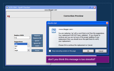
A while ago I was using blogger's spell checking feature (the old version in blogger's pre-beta). During spellcheck, blogger found an error in my spelling and displayed a list of suggestions. I wasn't very happy with the suggestions so I entered my own text in the 'replace with' box and hit Enter.
 Blogger then displayed the message box above, telling me that I chose to replace the erroneous text with my own input that was 'NOT VALIDATED' and recommended that I run spell check again.
Aside from being way too stressful, this message text is also way too long. users don't read message boxes. In fact, users dont read.
Sometimes a developer/designer realizes that a message might not be very clear to the user and decides he/she has to do something about that, but usually, decorating the text with ALL CAPS or adding more text just doesn't cut it. Message copy has to be simple and get out of the way quickly. Sometimes, using other design elements (such as a dialog that suggests, "run spellcheck again?") can help solve such issues instead of just wrestling with more text & effects.
If you're interested, Humanized has an interesting article about silly message boxes and some alternative solutions.
Labels: blogger, gui, spellchecking, ui

 Hebrew Blog
<< Home