Wet Floor Interfaces and user confusion
Nero is a well known CD/DVD burning application. It allows users to create various CD/DVD formats fairly easily.
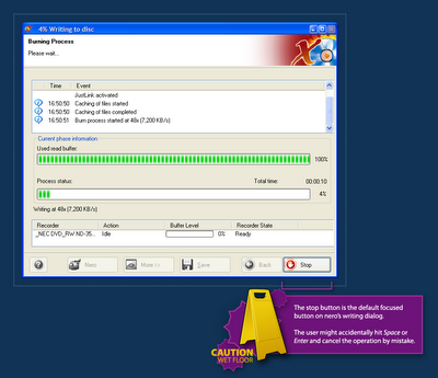
I've noticed an annoyance in Nero almost instantly when I started using it: It's burning dialog has the Stop button highlighted (focused) by default.
 When a user clicks the Burn button in Nero, the dialog above opens and the burning process is started. But Nero makes it far too easy for the user to cancel the process by mistake.
This is what one might call a Wet Floor Interface, it invites user errors when it actually intents to create a clean one-task interface. The burning process is Nero's epicentre but it's interface makes it too easy for users to accidentally slip on the floor and break something.
User interface design is often about making the right thing easy and the wrong thing hard. Interfaces like Nero's burning dialog are not too hard, but someone should go over them with a towel and wipe the water off the floor.
I've noticed an annoyance in Nero almost instantly when I started using it: It's burning dialog has the Stop button highlighted (focused) by default.
 When a user clicks the Burn button in Nero, the dialog above opens and the burning process is started. But Nero makes it far too easy for the user to cancel the process by mistake.
This is what one might call a Wet Floor Interface, it invites user errors when it actually intents to create a clean one-task interface. The burning process is Nero's epicentre but it's interface makes it too easy for users to accidentally slip on the floor and break something.
User interface design is often about making the right thing easy and the wrong thing hard. Interfaces like Nero's burning dialog are not too hard, but someone should go over them with a towel and wipe the water off the floor.
Labels: confusion, gui, interaction, nero, user

 Hebrew Blog
<< Home