Wrong indication and scaring users off
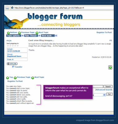
 When a new user visits bloggerforum, he sees an image similar to the one above. bloggerforum makes an exceptional effor to inform the user what he can and cannot do. It seems, however, that the user can hardly do anything.
One can assume that the bloggerforum people dont want to scare people off deliberately. The problem is that they're displaying unfiltered information. Someone thought that it's really important to tell the user exactly what he can and cannot do, instead of just placing a reply button for the thread and asking the user to sign up (or sign in) on the next page.
The register to post links are the most important ones on the entire page. They're the door for the most important interaction any user can have with a forum system - post in the forum. These links are not well placed and unlike some other links on the page (previous post, next post, etc.) have no images next to them.
Good design is often about creating clear hierarchy. Communicating to the user visually what is important and what isn't. bloggerforum clearly needs a hierarchy make over.

 Hebrew Blog
<< Home