Sunday, July 29, 2007

In love with a hippo


I love reading and listening to Kathy Sierra, her blog and talks can teach anyone amazing stuff about user interface design and product-making in general. One important question that Kathy often asks is: What products are you passionate about?

I'm passionate about filehippo.com, it's a wonderful wonderful site, providing speedy almost-1-click downloading of all the apps one needs on a windows machine (firewall, anti-spyware, winamp, acrobat, open-office, firefox, opera, etc.)

Everything is organized in a non-nonsense interface, the Search on the top right works like a charm if you want to quickly find something, and the logo is insanely great.

Great work.

Passionate about websites? Applications? online Radio?
Write a comment and tell me about it. (I'm curious)

Labels: ,

Saturday, July 21, 2007

The forgotten art of the landing page

I was reading some article on an Israeli content site and noticed an ad for a well-known israeli artschool called "Camera Obscura". I usually don't click on such flashy banner ads - but sometimes I do, wondering what the following page looks like.

It took me a few minutes to realize that I have no idea how I got the image above - it looks like some basic install of DotNetNuke (a web content management system), and it has a mini-form inside that asks the user for details such as name, email, etc.

The surprising thing is - this form appears to be real - it's not a bug - the people at Camera Obscura, or the agency that sold them the flash ad - sent all users clicking on the banner to this irrelevant looking page with the mini-mini form inside that's titled (loose translation): "Schedule a meeting / Request more information".

My bet is, only a tiny fraction of the users actually went on and entered the requested information. Most of them probably wondered what this weird pop-up page is and closed it right away.

It should be common knowledge by now, that animated flashy banner are not enough by themselves - they can be impressive and stuff, but if they direct users to a weird-looking page that has nothing to do with the look & feel of the original banner and context - they accomplish nothing.

The ad agency also abused its responsibility - it sold an online ad that achieves almost nothing - it only confuses users and leaves little or no impact.

For more on landing pages try seth godin's post on the subject.

Labels: , ,

Thursday, July 19, 2007

Wii hacking

I just saw this video again in a post on n.e.r.d.

It's really great to see such lovely applications of hacking - the Wii remote connected to some usb thingie I presume and into a macbookpro and used as an input device for a sound/live video app using the Mac's internal iSight camera.

Great, inspiring stuff.

Labels: ,

Wednesday, July 11, 2007

I Love Adium


I love Adium, I really do. such simplicity in an IM clone, and it works just perfect with all my msn buddies. Files get transferred pretty fast, they actually get transferred which is good. Buddy-icons are shown, everything just works.

It has a marvelous sound and Icon scheme, great themes out-of-the-box, absolutely lovable.

I've been meaning to write a post about that for quite some time now - I'm really passionate about using Adium. It's really IM reborn for me.

So there.

Labels: , ,

Sunday, July 01, 2007

The interface of a cheeseburger

A nice post on the iA blog titled The interface of a cheeseburger".

(I could write a lengthy link description, but that would spoil the fun of clicking a huge cheeseburger link image and waiting to see what opens up.)

Labels: ,

Tuesday, June 19, 2007

Hikikomori: or why I'm scared of leaving my room with my PC

There are some problem solving workflows that only come to mind when I encounter a problem that I haven't seen in a while. One example is the windows safemode -> change resolution -> restart in normal mode -> choose resolution again workflow that I often performed when moving a PC around between 2 different monitors.

But there's a catch, this workflow only works with windows versions before Windows 2000. If you're up-to-date, you'll have to think ahead before moving your PC between 2 different monitors.

I often move my PC at work between work rooms, and each room has some monitors already in place, but every time I do that, I suddenly remember that my relatively high resolution: (1280x1024 at 100 mhz on a 21" CRT monitor) just wont work on some new LCDs we got here.

One would expect that moving my PC between 2 monitors should be easy. Plug & Play and start working. But in fact, it's nothing but easy: It's impossible!

The old workflow of moving the PC to a new monitor, booting in Safe Mode and re-setting the screen resolution just doesn't work in Windows 2000 and up. When the user restarts back in Normal Mode, the old monitor resolution is selected again and my monitor refuses to display at 100 mhz once more - which makes the machine completly unusable!

I really tried everything I could think of to solve this problem without finding another 21" CRT just to lower my screen resolution - I even used Safe Mode to disable the display adapter device in the Device Manager, only to find out that when I start it back in Normal Mode after restart, The screen goes black again and resolution comes back to normal.

After giving up on all sorts of hacky workarounds, I ended up looking for another 21" CRT in the new work room, and finally found one only to use it for booting into Normal Mode and setting my resolution to 1024x768, making sure it's low enough for the new monitor.

Plug & Play is long considered dead in many areas such as Printer installation (more on that some other time), but is some ease of use, on such basic devices, really so much to ask?

Labels: ,

Thursday, April 12, 2007

Interesting technology stories

Low end mac is a long running mac website that features a serious of articles called Orchad. Orchad tells the stories behind many world-known technology projects and companies, mostly apple-related.

The articles are extremely well written and I can get carried a way and read a few of them instead of going back to work on my design work.

Great stuff.

I really enjoyed:
The NeXT Years
The Amiga Story
How Jean Louis Gassée Changed the Mac's Direction

Labels: ,

Tuesday, February 13, 2007

Interface experiments, EmoChat

Great flash experiments over at Typorganism, I especially like the EmoType Chat which includes several animation effects according to special emotion icons use: ";) ;( ;0"...

Labels: , , ,

Monday, January 29, 2007

Quick links

Thing have been fairly quite here, mainly because of the heavy workload of the semester. It'll be over real soon so stay tuned for some user interface rants as usual.

In the mean time, some quick links:

Over at subtraction.com, Khoi Vinh talks about a surprisingly nice feature in Apple's address book application.

Rich Ziade, of basement.org writes about Framing Software: communicating specific workflows by actually turning features off. And it's especially interesting that someone is talking about taking features off of 37signals' applications.

Labels: ,

Sunday, January 21, 2007

Inspiring tactile interfaces

Demos of tactile interfaces are always very inspiring. They often present stuff like futuristic new input methods and some creative software that goes along.

Stuff like Jeff Han's demonstration at TED or the TactaPad really makes you drool over your browser. But I think that even smaller input method innovations are inspiring as well. When I heard about 3DConnexions' devices for the first time I was really excited. I even thought about the possibilities of trying to build something similar with a 2nd trackball mouse connected to my PC.

I think my general point is that even slight innovations in existing input methods can seed the creations of new applications. Even more moderate stuff as the MacBook Pro's multitouch touch pad (1 finger for pointing the cursor, 2 fingers for scrolling) can enable, for example, 3 fingers 3d panning (in ZBrush perhaps?), etc.

Labels: , ,

Sunday, December 17, 2006

The horrors of functionality restrictions

About a year ago, my girlfriend bought an Epson CX3500 printer. It caused many problems almost from day one: The ink would ran out too quickly, less expensive re-fill ink wouldn't work right, the expensive ink wouldn't work well as well and so forth.

One particularly annoying behavior was the printer's refusal to print grayscale / black & white documents when it's color cartridges are empty.

Each time I hear about this problem I just go nuts. It makes me want to throw the printer out to the street and buy another one. It's just completely incomprehensible to me that the developers/designers at Epson thought this can be considered as a reasonable behavior.

The printer's entire goal in life is to print documents. It's not an online ink shopping website. It's not an ink commercial. It should never refuse to print my documents unless it absolutely can't. It should have no problem printing b/w documents if it has Black ink.

I have an HP psc at home. I really disliked hp printers before but this one has just been great to me. This hp also has a similar problem, but it's less of a pain: it refuses to print anything if one of the cartridges is missing, but it will print a b/w document even if the color cartridge is empty.

Someone at Epson thought it's reasonable to ask users to buy color printer cartridges to print black and white documents. That someone is obviously wrong. Products should empower users, not restrict them.

Labels: , , ,

Saturday, December 02, 2006

Take a close look at grandma

Richard has a great post on basement.org titled "technical ignorance is bliss" - he talks about the difficulties non-technical people often have with computers and software and how those difficulties can benefit us (developers, designers) as spectators.

Labels: , ,

Wednesday, November 15, 2006

The interface is the system

Dan wrote an interesting post on the adaptivepath blog: "The interface is the system". Users perceive the entire system through it's interface and are unable to differentiate one from the other. They are unaware of the system's internals and details - they only see what they interact with...

Labels: , ,

Friday, October 27, 2006

Interaction Desing Inspiration

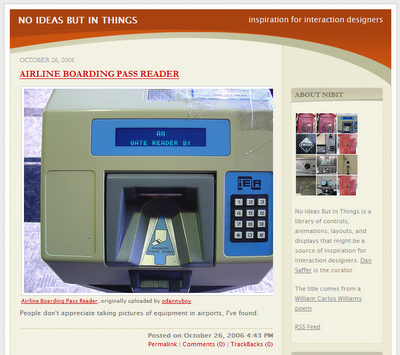
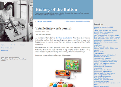
Two blog links for interaction design inspiration:

1. no ideas but in things:
website thumbnail screenshot
2. History of the Button:
website thumbnail screenshot

Labels: , , , ,

Wednesday, October 25, 2006

Wet Floor Interfaces and user confusion

Nero is a well known CD/DVD burning application. It allows users to create various CD/DVD formats fairly easily.

I've noticed an annoyance in Nero almost instantly when I started using it: It's burning dialog has the Stop button highlighted (focused) by default.

When a user clicks the Burn button in Nero, the dialog above opens and the burning process is started. But Nero makes it far too easy for the user to cancel the process by mistake.

This is what one might call a Wet Floor Interface, it invites user errors when it actually intents to create a clean one-task interface. The burning process is Nero's epicentre but it's interface makes it too easy for users to accidentally slip on the floor and break something.

User interface design is often about making the right thing easy and the wrong thing hard. Interfaces like Nero's burning dialog are not too hard, but someone should go over them with a towel and wipe the water off the floor.

Labels: , , , ,

Saturday, October 14, 2006

How to score on a date with your users (or: Setting realistic expectations)

Some episodes of MADtv included a returning sketch called Lowered Expectations. The sketch featured weird candidates appearing in a video dating service for those who have 'low expectations'. In a similar way, developers often need to lower their expectations in order to enable successful user/software interactions.

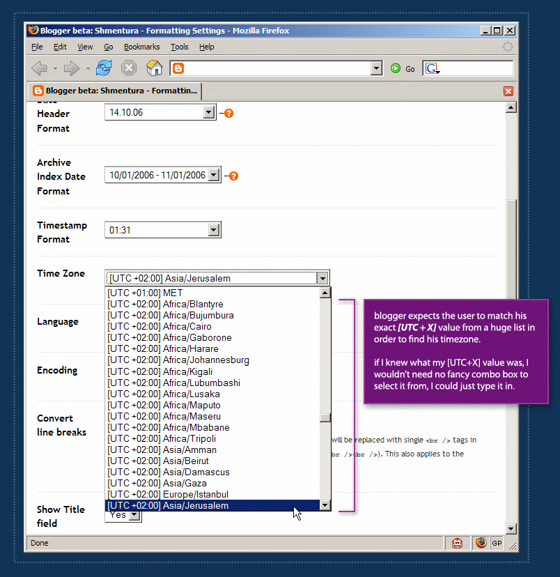
Application developers often expect their users to perform unrealistic tasks. They require users to recall many details, click miniature links with their mice or precisely type long URLs:

In order to define a blog's timezone in Blogger, a user must scroll through a huge list which is sorted by the [UTC+X] offset values. Each item in the list includes the UTC offset of the timezone, continent name and a major city in the area.

Blogger is setting unrealistic expectations. It actually expects the user to know his UTC offset in order to find his location on the list. After a 3-4 minutes of scrolling back and forth, I remembered Israel is either UTC+2 or UTC+3. But defining my blog timezone should not take 4 minutes.

Realistic expectations take user abilities into consideration. It's reasonable to assume that the user can define his location with no problem, but it's completely unreasonable to assume that he knows his UTC offset value.

So how do you score on a date with your users? You make it dead-easy for them to achieve their goals and make it hard for them to get confused and make mistakes.

Labels: , , , , , , ,

Sunday, October 08, 2006

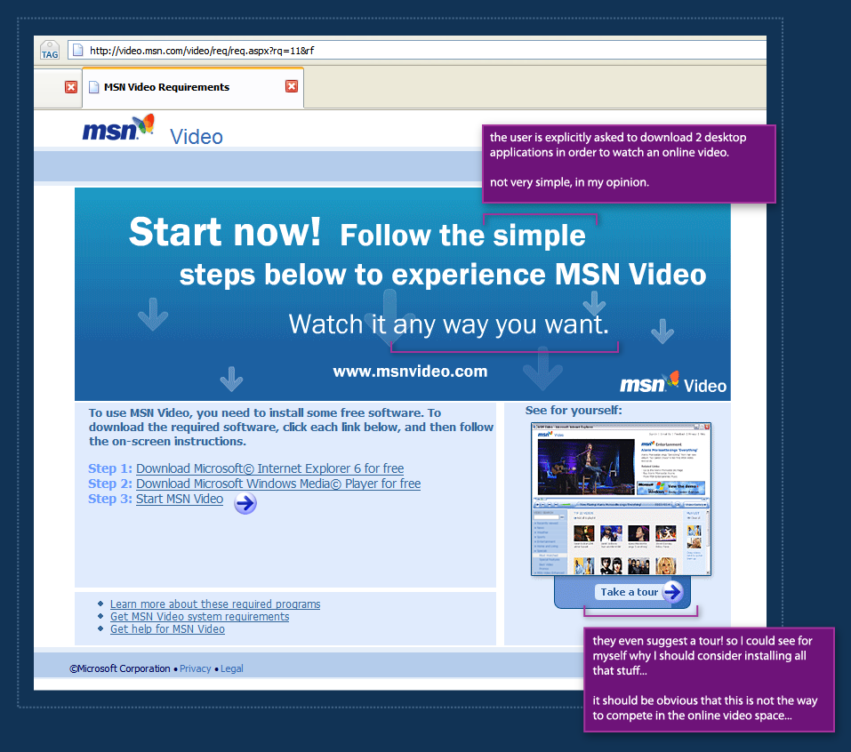
MSN Video "Simplicity": Install 3 applications and we'll let you right in

It's no secret that online Microsoft websites often have problem with non IE browsers. But I was really surprised to see MSN Video Israel demanding so much from me when I first entered the site to watch a flick.

The Israeli MSN Video version requires the user to: (free translation from Hebrew) "verify" that his computer "complies with the requirements" and then click the "activate MSN Video link. The problem is, in my opinion, that if the user actually installs those applications, he'll be forced to reboot his computer and won't be able to click this link. Not to mention the fact that the video he originally came to see will be forgotten, surely it's URL will be lost.

MSN Video in English has a different screen, but I'm not sure which is worse. This version suggest 3 simple steps. If this is Microsoft's idea for simplicity, someone clearly has a problem. The site even goes further by suggesting a tour! they're trying to convince me it just might be worth it to download and install this stuff.

The whole point of services like YouTube is leveraging software users already have installed and making it dead-easy to share media on the web. MSN Video clearly demands too much from new users.

This is clearly not the way to compete in the online video space.

Labels: , , , , , , ,

Friday, October 06, 2006

Wrong indication and scaring users off

When a new user visits bloggerforum, he sees an image similar to the one above. bloggerforum makes an exceptional effor to inform the user what he can and cannot do. It seems, however, that the user can hardly do anything.

One can assume that the bloggerforum people dont want to scare people off deliberately. The problem is that they're displaying unfiltered information. Someone thought that it's really important to tell the user exactly what he can and cannot do, instead of just placing a reply button for the thread and asking the user to sign up (or sign in) on the next page.

The register to post links are the most important ones on the entire page. They're the door for the most important interaction any user can have with a forum system - post in the forum. These links are not well placed and unlike some other links on the page (previous post, next post, etc.) have no images next to them.

Good design is often about creating clear hierarchy. Communicating to the user visually what is important and what isn't. bloggerforum clearly needs a hierarchy make over.

Labels: , , , , , ,

Wednesday, September 20, 2006

Leveraging user familiarity to increase usability

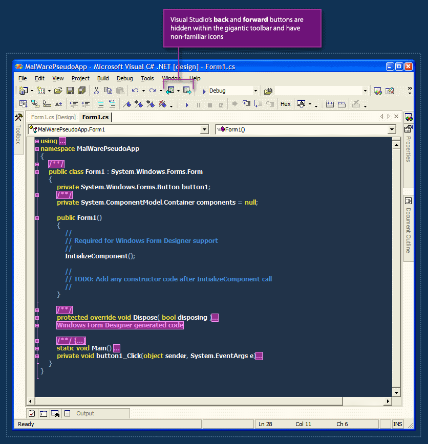
Visual Studio.net has a nice back & forward feature. This feature allows the user to jump through recently visited locations in his code files. The problem with this feature is that it's practically hidden from the user.

The back & forward buttons are almost-randomly placed within the crowded toolbar, and they also have non-familiar icons. I often hover the toolbar back and forth with the mouse cursor until I'm able to find the back button with my eyes.

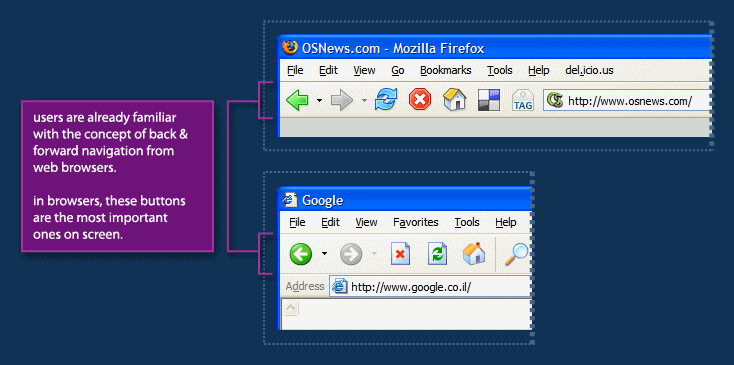
In web browsers, from which this metaphor is borrowed, the back & forward buttons are by far the most important ones on screen. They are placed in the far left of the toolbar making them easy to hit with the mouse and they are the perceived as one of the cornerstones of navigation on the web.

The Visual Studio Team did a great job with borrowing the back & forward metaphor from web browsers to the code-editor world, but they could go further by leveraging users' familiarity with the placement and visual-styling of these buttons to make this feature more noticable - and as a result, make code navigation easier.

Labels: , , , , , , , ,