Sunday, January 21, 2007

Inspiring tactile interfaces

Demos of tactile interfaces are always very inspiring. They often present stuff like futuristic new input methods and some creative software that goes along.

Stuff like Jeff Han's demonstration at TED or the TactaPad really makes you drool over your browser. But I think that even smaller input method innovations are inspiring as well. When I heard about 3DConnexions' devices for the first time I was really excited. I even thought about the possibilities of trying to build something similar with a 2nd trackball mouse connected to my PC.

I think my general point is that even slight innovations in existing input methods can seed the creations of new applications. Even more moderate stuff as the MacBook Pro's multitouch touch pad (1 finger for pointing the cursor, 2 fingers for scrolling) can enable, for example, 3 fingers 3d panning (in ZBrush perhaps?), etc.

Labels: , ,

Saturday, December 02, 2006

Take a close look at grandma

Richard has a great post on basement.org titled "technical ignorance is bliss" - he talks about the difficulties non-technical people often have with computers and software and how those difficulties can benefit us (developers, designers) as spectators.

Labels: , ,

Friday, November 24, 2006

Inquisitor is genius

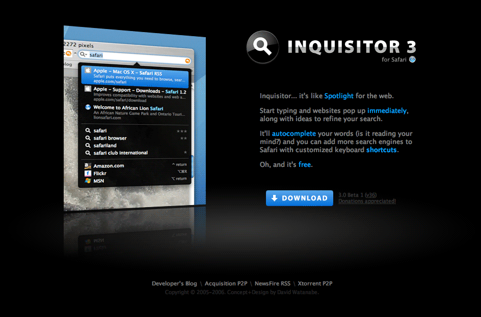
Inquisitor 3 is a great search plugin for Safari (apple's web browser). It implements Spotlight-like functionality for Safari. (just type something in the search box and get immediate highlighted results, autocompletion suggestions, etc).

This application is an immediate Bonzai. The developer just completely nailed it. It works amazingly fast, it's dead easy (since the user is only required to use the search box the same way he is already used to) and it works just great.

I just wish I could have that on Firefox on my mac, and actually, on Firefox everywhere.

Labels: , , , , ,

Tuesday, October 10, 2006

Stressed out message boxes and design alternatives

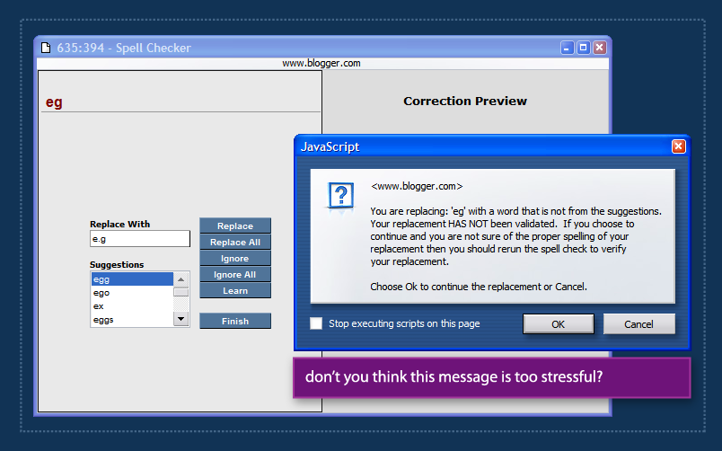
A while ago I was using blogger's spell checking feature (the old version in blogger's pre-beta). During spellcheck, blogger found an error in my spelling and displayed a list of suggestions. I wasn't very happy with the suggestions so I entered my own text in the 'replace with' box and hit Enter.

Blogger then displayed the message box above, telling me that I chose to replace the erroneous text with my own input that was 'NOT VALIDATED' and recommended that I run spell check again.

Aside from being way too stressful, this message text is also way too long. users don't read message boxes. In fact, users dont read.

Sometimes a developer/designer realizes that a message might not be very clear to the user and decides he/she has to do something about that, but usually, decorating the text with ALL CAPS or adding more text just doesn't cut it. Message copy has to be simple and get out of the way quickly. Sometimes, using other design elements (such as a dialog that suggests, "run spellcheck again?") can help solve such issues instead of just wrestling with more text & effects.

If you're interested, Humanized has an interesting article about silly message boxes and some alternative solutions.

Labels: , , ,

Friday, October 06, 2006

Wrong indication and scaring users off

When a new user visits bloggerforum, he sees an image similar to the one above. bloggerforum makes an exceptional effor to inform the user what he can and cannot do. It seems, however, that the user can hardly do anything.

One can assume that the bloggerforum people dont want to scare people off deliberately. The problem is that they're displaying unfiltered information. Someone thought that it's really important to tell the user exactly what he can and cannot do, instead of just placing a reply button for the thread and asking the user to sign up (or sign in) on the next page.

The register to post links are the most important ones on the entire page. They're the door for the most important interaction any user can have with a forum system - post in the forum. These links are not well placed and unlike some other links on the page (previous post, next post, etc.) have no images next to them.

Good design is often about creating clear hierarchy. Communicating to the user visually what is important and what isn't. bloggerforum clearly needs a hierarchy make over.

Labels: , , , , , ,

Friday, September 29, 2006

Howto: create vector application mockups using Visio & Illustrator

Visio 2003 is a great tool for creating mockups of Windows XP user interfaces. It features a complete stencil that includes many common windows control that were re-drawn as Visio vector shapes.

However, by itself, Visio isn't always sufficient for creating an entire, detailed application mockup. such mockups often require graphics that are hard to produce on Visio alone.

This quick tutorial will show you how to create a detailed vector mockup using both Visio and Adobe Illustrator.
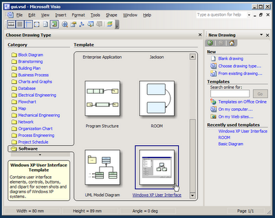
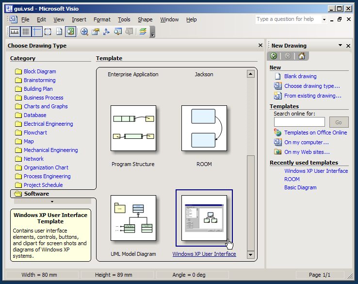
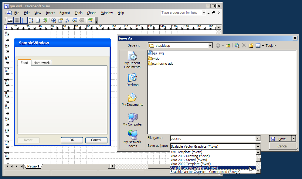
When you first start Visio, the Choose Drawing Type screen appears. choose the Windows XP User Interface drawing type from the Software catagory.
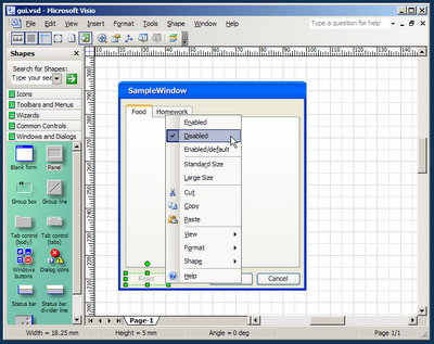

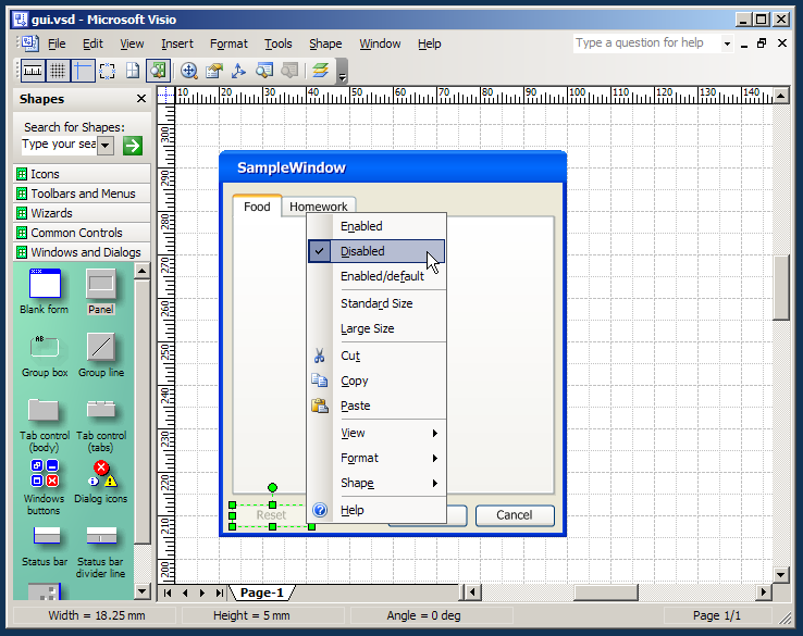
Design your application form using the common controls and shapes found in the stencils on the left. Drag a form first, followed by some buttons and panels. Note: most controls have options that can be set using the context menu.
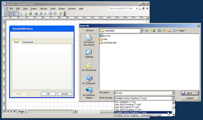

Goto File->Save As and save your file as a SVG file. SVG stands for "Standard Vector Graphics". it's a file format used by many vector graphics applications to exchange drawings. We will open this file with illustrator for further editing. Copying and Pasting the contents of your mockup from Visio to Illustrator might seem quicker, but it doesn't produce well-organized results. (it seems to create redundant, inaccurate shapes.)
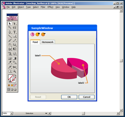

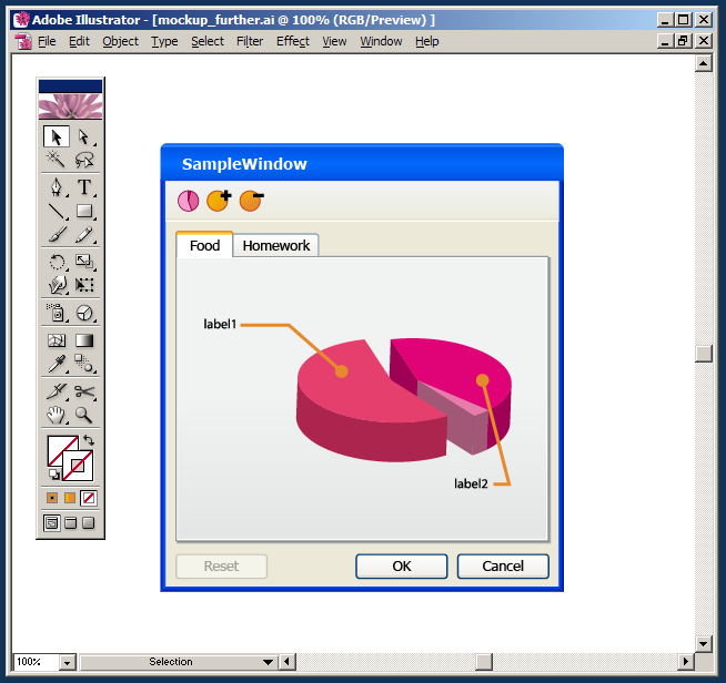
Open the .SVG file with Adobe Illustrator and edit it further. add some special graphics that could not be done in Visio. (here, I added a 3d pie chart and some quick toolbar icons). When initially opened, the file's content might be over-grouped, select your mockup form and hit Ctrl+Shift+G (Ungroup shortcut) until the mockup is completely un-groupped so you can work with it. You can also add another layer above the mockup and lock the layer holding the mockup for easier editing.
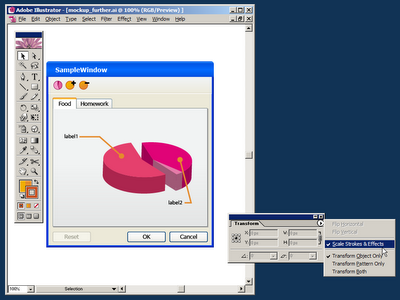

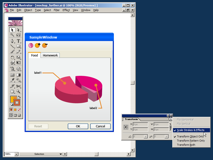
When you're done working on the mockup in Illustrator and ready to use it in another vector file (a Campaign Poster, in my case), make sure the Scale Strokes and Effects option is checked. (this option can be found in the Transform window - open it from Window->Transform.) when turned on, this option tells Illustrator to scale the line strokes and effects applied to each shape. It then allows the scaling of our mockup into any size, without damaging and line work or quality.
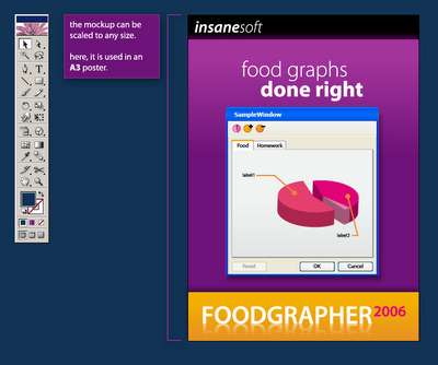

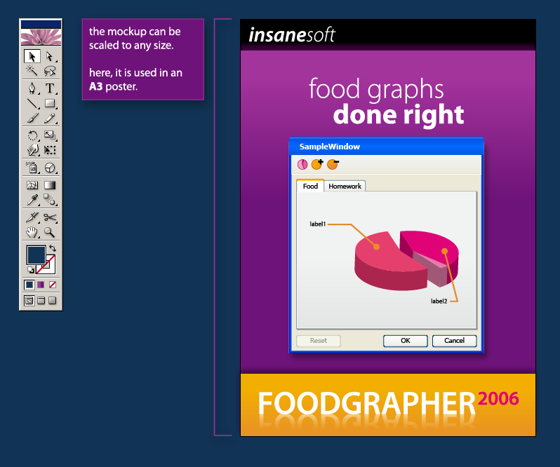
Finally, place the finished mockup into your desired vector drawing, scale it (proportionally - holding Shift) into the desired size. In the screenshot above I've used my mockup in an A3 sized poster.

Great work. We've just created a resolution independent mockup of our imaginary app. We can now make versions of it for our website, posters and T shirts.

Labels: , , , , , , , ,

Friday, September 22, 2006

The Programmer's inner Designer: syntax color tweaking

Ever since I started writing code, I've always found great interest in Syntax Coloring. At the same time, however, I found it a bit weird that I enjoy tweaking and re-tweaking my syntax highlighting colors so much.

I was very happy to see a few recent posts over at coding horror about syntax coloring and programming font choices and immediately felt the need to share my own thoughts about syntax color palettes.

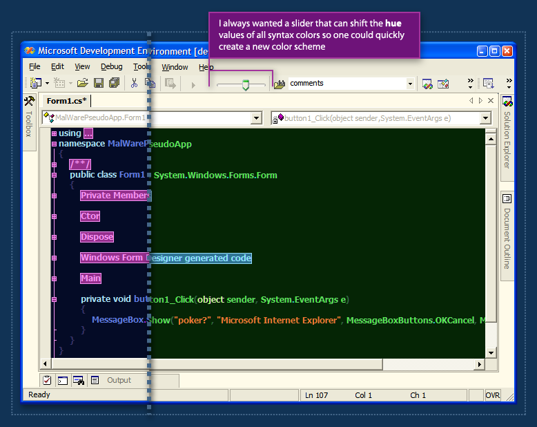
During my work with .net in the last 4 years, I've slowly tweaked my color scheme to the screenshot above. It uses the font Tahoma Bold even though its not a fixed-width font. At it's brightest days, there were 4 of us using it. We once shouted the RGB values of the entire palette across the workspace to a person sitting in a distant cubicle. (that was before we realized we can export the palette from the registry...)

I always wanted to have a small slider in the IDE's toolbar that would allow the user to slide all the hue values of the syntax colors so the user would be able to create a new color palette for each file, or just play around. Since the original palette is usually already color-balanced, shifting the entire palette around the hue axis should not break much of that balance, and it would create fun results. (see the screenshot above)

I think this coloring customization is appealing to people in the same way that desktop wallpaper and ring tones appeal to others. Customization of apps one uses every day is just fun. When you spend a few minutes thinking about it, it's a lot like your clothing choices. People are actually trying to communicate something about themselves using their ring-tone choices. People are communicating something about themselves with their clothing & wallpaper choices.

What are we saying about ourselves through our syntax color scheme choices?

Labels: , , , , , , , , , ,

Wednesday, September 20, 2006

Leveraging user familiarity to increase usability

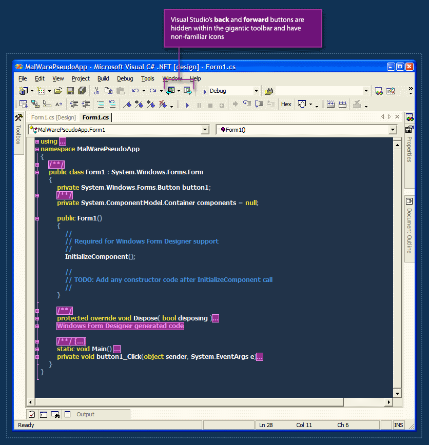
Visual Studio.net has a nice back & forward feature. This feature allows the user to jump through recently visited locations in his code files. The problem with this feature is that it's practically hidden from the user.

The back & forward buttons are almost-randomly placed within the crowded toolbar, and they also have non-familiar icons. I often hover the toolbar back and forth with the mouse cursor until I'm able to find the back button with my eyes.

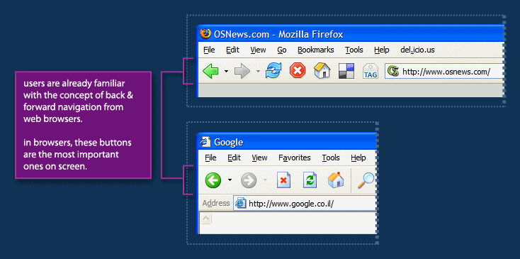
In web browsers, from which this metaphor is borrowed, the back & forward buttons are by far the most important ones on screen. They are placed in the far left of the toolbar making them easy to hit with the mouse and they are the perceived as one of the cornerstones of navigation on the web.

The Visual Studio Team did a great job with borrowing the back & forward metaphor from web browsers to the code-editor world, but they could go further by leveraging users' familiarity with the placement and visual-styling of these buttons to make this feature more noticable - and as a result, make code navigation easier.

Labels: , , , , , , , ,