How to score on a date with your users (or: Setting realistic expectations)
Some episodes of MADtv included a returning sketch called Lowered Expectations. The sketch featured weird candidates appearing in a video dating service for those who have 'low expectations'. In a similar way, developers often need to lower their expectations in order to enable successful user/software interactions.
Application developers often expect their users to perform unrealistic tasks. They require users to recall many details, click miniature links with their mice or precisely type long URLs:
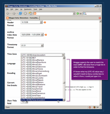 In order to define a blog's timezone in Blogger, a user must scroll through a huge list which is sorted by the [UTC+X] offset values. Each item in the list includes the UTC offset of the timezone, continent name and a major city in the area.
Blogger is setting unrealistic expectations. It actually expects the user to know his UTC offset in order to find his location on the list. After a 3-4 minutes of scrolling back and forth, I remembered Israel is either UTC+2 or UTC+3. But defining my blog timezone should not take 4 minutes.
Realistic expectations take user abilities into consideration. It's reasonable to assume that the user can define his location with no problem, but it's completely unreasonable to assume that he knows his UTC offset value.
So how do you score on a date with your users? You make it dead-easy for them to achieve their goals and make it hard for them to get confused and make mistakes.
Labels: blogger, confusion, dating, expectations, gui, interaction, timezone, user
posted by Guy at 02:26
![]()

 Hebrew Blog
 Subscribe to this blog's feed