Leveraging user familiarity to increase usability
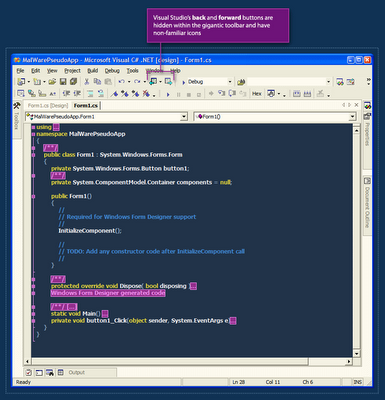
 Visual Studio.net has a nice back & forward feature. This feature allows the user to jump through recently visited locations in his code files. The problem with this feature is that it's practically hidden from the user.
The back & forward buttons are almost-randomly placed within the crowded toolbar, and they also have non-familiar icons. I often hover the toolbar back and forth with the mouse cursor until I'm able to find the back button with my eyes.
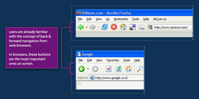
 In web browsers, from which this metaphor is borrowed, the back & forward buttons are by far the most important ones on screen. They are placed in the far left of the toolbar making them easy to hit with the mouse and they are the perceived as one of the cornerstones of navigation on the web.
The Visual Studio Team did a great job with borrowing the back & forward metaphor from web browsers to the code-editor world, but they could go further by leveraging users' familiarity with the placement and visual-styling of these buttons to make this feature more noticable - and as a result, make code navigation easier.
Labels: browser, gui, interaction, interactive, styling, ui, usability, visualstudio, vs.net

 Hebrew Blog
<< Home