Communicating the wrong message: Security applications should not look like cheesy media players!

A while ago, I read the excellent "The iPod and the Bathtub" (great pdf version) article published by frog-design. The article discusses products and the message their design communicates.
When it comes to communicating a message with user-interface design, some applications do a great job, while others clearly communicate the wrong message:
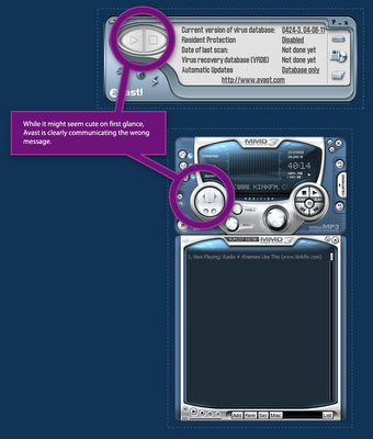
 Avast Personal Anti Virus looks like a media player, and it's also skinnable. It's obvious that avast did this deliberately, but in my opinion, when you try to create a broad user range to a home security product such as an antivirus, such strong resemblance to a home stereo or media player application isn't good. This interface design communicates: "I'm a fun application!", "Scanning my computer for viruses is just like playing music", "I can do that all day!"
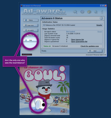
 Lavasoft Ad-Aware is a great application, I use it frequently to remove spyware, but ever since I first saw it, it always reminded me of Bouli (hebrew). The interface looks like a snowman. And again, this application is trying to say: "You can rely on me" and "I will protect you against those evil mal-ware" and it's not trying to say "oh I'm so cute and fluffy, let's cuddle".
Communicating a message with user interface design is especially hard when you're designing a desktop application. in the web, conventions are loose and many variations work well. In desktop applications however, there are many user-interface guidelines to follow, and variation is somewhat limited. The real challenge is to succeed in communicating the right message, while not breaking out from the platform conventions all together.

 Hebrew Blog
<< Home