Choosing the right paradigm: complex dialogs and control choice

At work, we make extensive use of Steema TeeChart. TeeChart is a gui component that can render great looking 2d and 3d charts for a variety of applications. We're also exposing its TeeChart Editor in our own gui design applications so users can custom the look and behaviour of such charts.
 However, the Steema Editor makes customization extremely difficult because it uses a monstrous amount of Tab pages. in the screenshot above, the user has navigated through 5 (!) levels of tabs in order to get to his desired setting. These tabs are structured - every line has a selected tab that holds all tabs within the next line. At work, both users and developers repeatedly fail at customizing such charts because they just can't remember where the desired settings are. (there are many options, and the navigation through them are very confusing).
The main problem here is that structured information is badly displayed. The tab pages are confusing and although they are supposedly structured, they do a very bad job at visualizing the customization categories TeeChart offers.
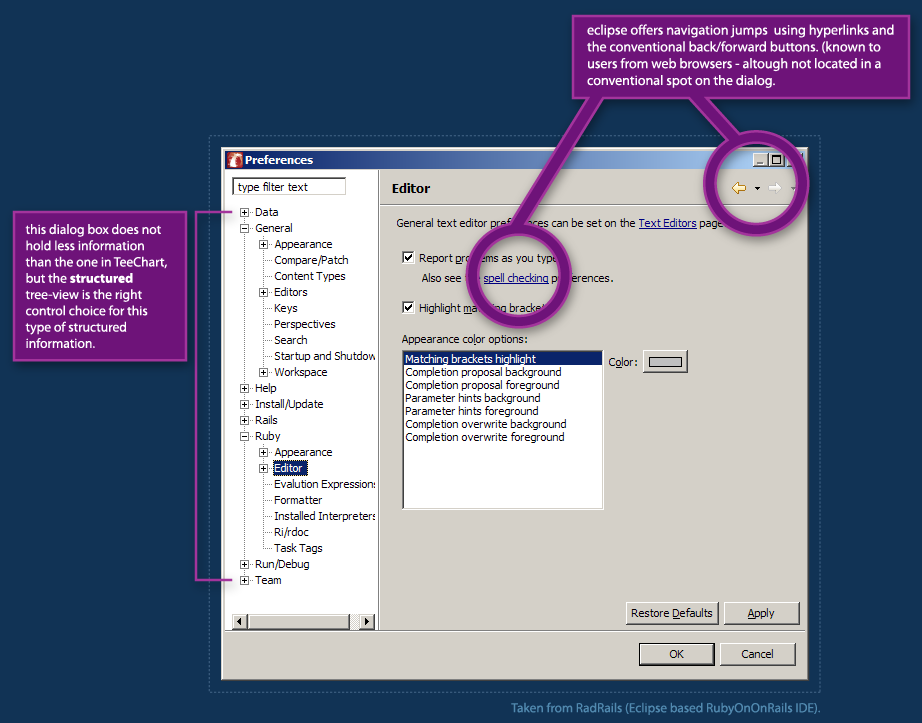 A better example of structured settings display can be seen in Eclipse's Preferences dialog. The customization categories are structured in a similar way but they are visualized using a tree-view. Tree views provide straightforward display of structured information and allow easier navigation.
Eclipse goes further by adding hyperlinks within the actual settings view, together with a conventional set of back & forward buttons - which users are very familiar with from the web-browser world. (although they are mis-placed in a non-conventional spot within the actual dialog and look a bit too-different from the common back/forward buttons.)
This goes to show that choosing the proper visualization for even complex data can have a tremendous effect on whether users are able to percieve the information and make good use of the tool.
For further reading (and some good laughs) on Tabbed Dialogs - check The Interface Hall of Shame - Tabbed Dialogs.
Like this article? please Digg it.
posted by Guy at 00:32
![]()
 Hebrew Blog
 Subscribe to this blog's feed
<< Home