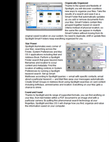
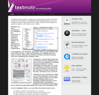
Resized screenshots are evil!


Screenshots were created to be taken and displayed in Actual Size. However, many serious software houses continue to display resized versions of their screenshots.
Screenshots should never be resized. they should be display in full detail for everyone to see, allowing users and random website traffic to look at the details and "feel" the application up close.
In the 2 screencaptures in this post you can see the websites of apple and textmate display miniature versions of their screenshots - and they both communicate very little. This is especially a shame since they work very hard on usability and graphic design...
A few things that can help when trying to produce proper screenshots:
- Before taking the screenshot, change to a low resolution (e.g 800x600) - and place windows accordingly.
- Never ever save screenshots in JPG format. JPG's compression creates dirt around very contrast graphic - which results in a messy image.
- If you must take the screenshot at a high resolution - Crop it, but plan the crop according to the screenshot purpose.

 Hebrew Blog
<< Home