Interaction Desing Inspiration
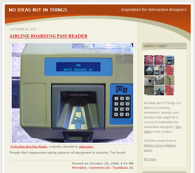
1. no ideas but in things:
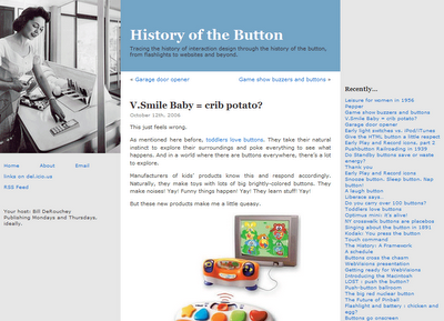
2. History of the Button:
Labels: gui, interaction, ixd, links, quicklinks


Labels: gui, interaction, ixd, links, quicklinks
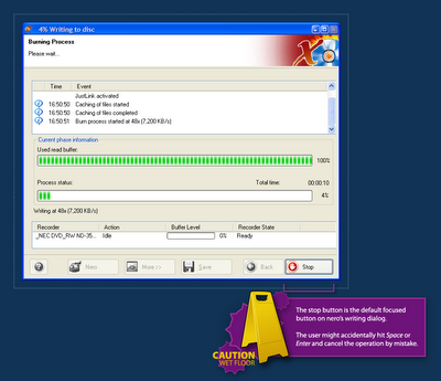 When a user clicks the Burn button in Nero, the dialog above opens and the burning process is started. But Nero makes it far too easy for the user to cancel the process by mistake.
Labels: confusion, gui, interaction, nero, user
 no fat clips is a wonderful, wonderful blog. It contains daily direct-download links to music videos, short movies, motion graphics and other kinds of visual entertainment.
Labels: broadcast, goldmine, links, motiongraphics, quicklinks
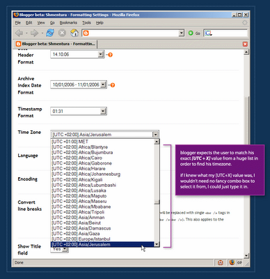 In order to define a blog's timezone in Blogger, a user must scroll through a huge list which is sorted by the [UTC+X] offset values. Each item in the list includes the UTC offset of the timezone, continent name and a major city in the area.
Labels: blogger, confusion, dating, expectations, gui, interaction, timezone, user


Labels: design, graphicdesign, illustration, links, quicklinks, visual, weekend

Labels: graphicdesign, links, quicklinks
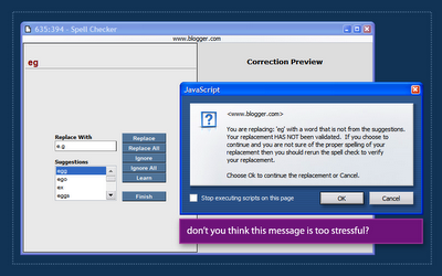 Blogger then displayed the message box above, telling me that I chose to replace the erroneous text with my own input that was 'NOT VALIDATED' and recommended that I run spell check again.
Labels: blogger, gui, spellchecking, ui
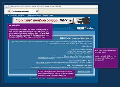 It's no secret that online Microsoft websites often have problem with non IE browsers. But I was really surprised to see MSN Video Israel demanding so much from me when I first entered the site to watch a flick.
 MSN Video in English has a different screen, but I'm not sure which is worse. This version suggest 3 simple steps. If this is Microsoft's idea for simplicity, someone clearly has a problem. The site even goes further by suggesting a tour! they're trying to convince me it just might be worth it to download and install this stuff.
Labels: gui, interaction, media, msn, msnvideo, video, web2.0, youtube
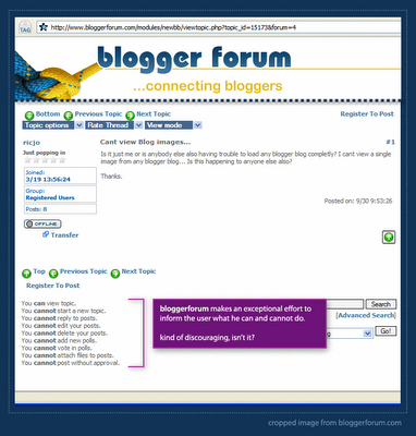 When a new user visits bloggerforum, he sees an image similar to the one above. bloggerforum makes an exceptional effor to inform the user what he can and cannot do. It seems, however, that the user can hardly do anything.
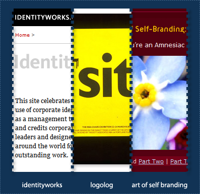 Some great logo / identity design links:
Labels: branding, graphicdesign, identity, links, logo, quicklinks, typography
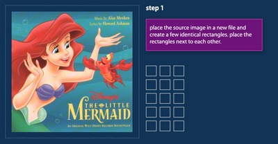 Step 1: find a source image on the net and place it inside an illustrator document. draw a few matching rectangles and place them next to each other.
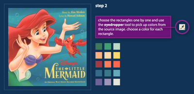 Step 2: Choose the rectangles one by one and use the eyedropper tool to pick up colors from the source image. Try to create a pallete that represents the primary colors of the source image.
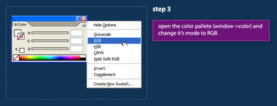 Step 3: Open Illustrator's Color palette (Window Menu->Color) and set its color mode to RGB.
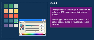 Step 4: The Color palette displays colors of the selected shape. We will use this window in the next steps to copy the RGB values of our colors into Visual Studio.
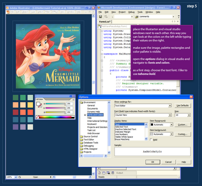 Step 5: After we've created a palette in Illustrator, we're ready to start applying this palette to actual code syntax in Visual Studio. Open Visual Studio and place the Illustrator and Studio windows next to each other (see image above). This placement will make it easier for us to copy the color values to Visual Studio. As a first step, we'll choose the text font. I use Tahoma Bold for all my syntax palettes.
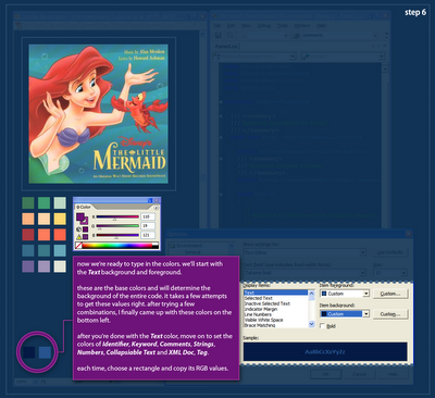 Step 6: In order to apply the palette to the syntax colors in Visual Studio, we have to select each syntax element and assign the RGB values from the palette rectangles. We will start with the Text element because it determines the background of the entire palette. The Text colors are kind-of hard to get right, and you might need a few attempts to get those to work. When you think you can move on, start setting colors for the Identifier, Keyword and Comment elements. then click Ok. after settings those basic elements you could probably see if your palette is heading in a good direction. Continue on to define the Strings, Numbers, XML Doc & Tags and Collapsible Text.
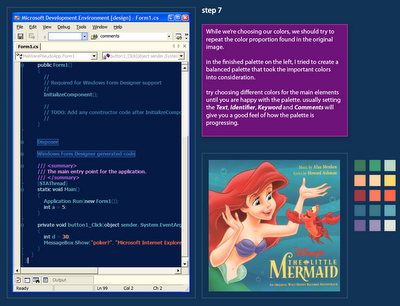 Step 7: This is a screen-capture of the palette I created after quite a lot of playing around. I was trying to preserve the feel of the illustration, although I did not use the exact color proportion. The result is a coherent syntax coloring palette that would be very hard to accomplish without a visual reference.
Labels: colors, dotnet, graphicdesign, illustrator, syntaxcoloring, tutorial, visualstudio